Please register to participate in our discussions with 2 million other members - it's free and quick! Some forums can only be seen by registered members. After you create your account, you'll be able to customize options and access all our 15,000 new posts/day with fewer ads.
Offering for your perusal an interesting website that presents the 2012 election results as cartograms, which give a much more accurate picture of the demographics of this elections.
For example:
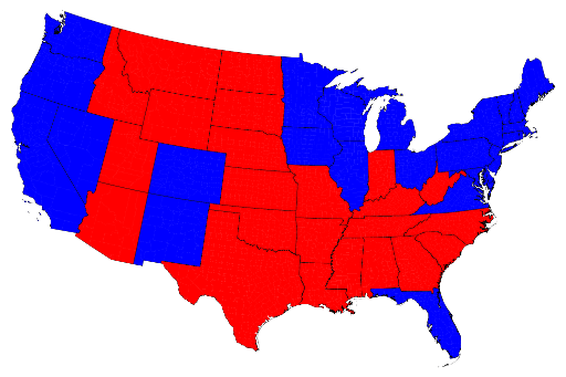
The above is a typical map of the results of the 2012 election.
Quote:
The states are colored red or blue to indicate whether a majority of their voters voted for the Republican candidate, Mitt Romney, or the Democratic candidate, Barack Obama, respectively. Looking at this map it gives the impression that the Republican won the election handily, since there is rather more red on the map than there is blue. In fact, however, the reverse is true – it was the Democrats who won the election. The explanation for this apparent paradox, as pointed out by many people, is that the map fails to take account of the population distribution. It fails to allow for the fact that the population of the red states is on average significantly lower than that of the blue ones. The blue may be small in area, but they represent a large number of voters, which is what matters in an election.
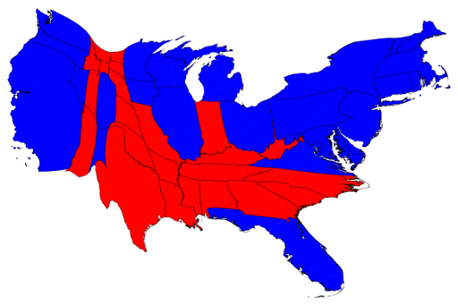
We can correct for this by making use of a cartogram, a map in which the sizes of states are rescaled according to their population. That is, states are drawn with size proportional not to their acreage but to the number of their inhabitants, states with more people appearing larger than states with fewer, regardless of their actual area on the ground. On such a map, for example, the state of Rhode Island, with its 1.1 million inhabitants, would appear about twice the size of Wyoming, which has half a million, even though Wyoming has 60 times the acreage of Rhode Island.
Here are the 2012 presidential election results on a population cartogram of this type:
There are more maps on the website - some broken down to county levels. Election maps
The country is not nearly as 'red' as Republicans would like for us to think.....
Zelva, I have driven through a lot of that red, there isn't many people who live in those areas, so all that map tells me is that people in rural areas tend to lean Republican....though it also shows me where most people in this country live goes blue. So that sounds good to me.
That mostly-red map would actually matter if cows and tumbleweeds could vote. But they can't.
It is, however, mildly interesting to see that there were only 3 states out of the 48 depicted where every county went for Romney: Utah, West Virginia, and Oklahoma. Likewise, only 3 states went entirely for Obama: Vermont, Mass., and RI.
Adding population density into the equation adds a new variable that many people just don't have the ability to understand. They simply see more area in Red and assume it means more people voted republican.
Yep;that one shows just now much local and state house control was gained startig with mid terms elections.Then of course one has to look at where the population gains trned to see future .
This is a far more accurate demographic representation...
The solid red areas are pretty much devoid of people....
Intresting how Suburban/Urban Eastern Mass was LESS Democratic than rural Western Mass.
Please register to post and access all features of our very popular forum. It is free and quick. Over $68,000 in prizes has already been given out to active posters on our forum. Additional giveaways are planned.
Detailed information about all U.S. cities, counties, and zip codes on our site: City-data.com.

 Please register to participate in our discussions with 2 million other members - it's free and quick! Some forums can only be seen by registered members. After you create your account, you'll be able to customize options and access all our 15,000 new posts/day with fewer ads.