Please register to participate in our discussions with 2 million other members - it's free and quick! Some forums can only be seen by registered members. After you create your account, you'll be able to customize options and access all our 15,000 new posts/day with fewer ads.
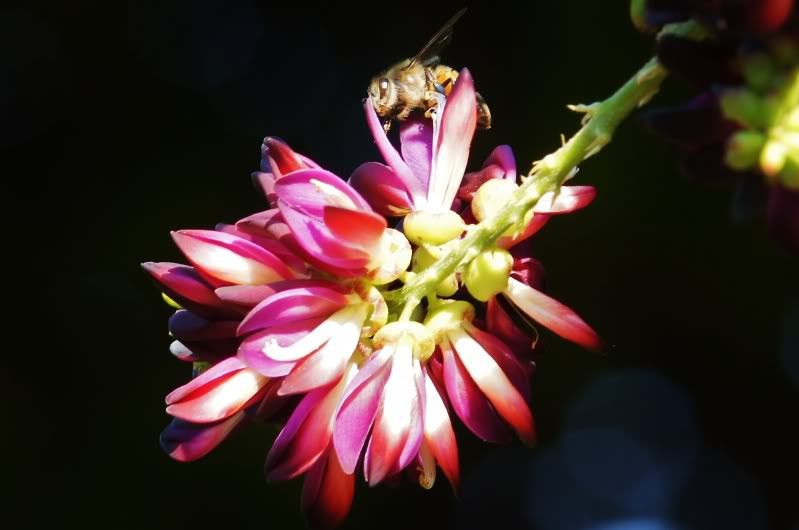
EinsteinsGhost, in a different thread, has graciously consented to a request for permission to repost a really beautiful flower picture of his as an example of before and after editing. There was nothing done to the entire image, but in different parts the contrast was changed and some areas were sharpened slightly while other areas were blurred slightly. The intended effects were to change both the bokeh and saturation.
Comments about the two variations as a whole are welcome, but comments about specific edits or areas of the image would also be interesting. For example, should the color saturation have been left as it was? Should the green stems to the right side have been blurred more, or even completely removed? How about the shading on the right side background, is that better when it is darker or lighter? Did the image actually need less contrast, or would more have been better?
Keep in mind, there is no "right" and no "wrong" here. This is just a question of what do you like, and we might all like it a little different.
Now this is only my opinion - and humble at best....
I do like the post-processed DOF/Bokeh...it brings the focus onto the petals more and it is more alluring.
The contrast and highlights, to me, are overblown. And the added sharpness appears to cause aberrations on the edges of the petals.
That all being said, and of course only my opinion, I have to wonder with all the different resolutions of computers/monitors...if that doesn't effect the viewing of the images? Could it be that the images look optimal on one monitor, but due to different calibrations, lack in quality on another? Or is it even discernible enough to pose a quandry?
My critique on the post processed picture (first) would be that the flower looks unnaturally darker. But then, as the photographer, I know it but a buyer or a viewer won't. But then, perhaps one could say that the flower would look significantly darker under certain lighting conditions than it would otherwise. That also goes for the faux vignetting, intended or not, in the post-processed picture. For a pixel peeper, the edge of the petals can be an issue as well, from relative softness to extra-ordinarily sharp.
Here is an example of picture without such post processing efforts (but taken in early morning light when it was still limited, unfortunately I didn't upload the original uncropped picture of this shot for comparison worthy of this thread):
The only thing I would change in the above picture would be getting rid of the spots to the lower right of the frame (from the bokeh) either using cloning tool in PS or simply increasing the contrast might do it, may be a touch highlight recovery in the middle to soften the appearance. MAy be an 8x10 proportioned crop would help also (to remove the bright distraction near the right top corner). I wouldn't go for more sharpening though for similar reasons as I wouldn't do it on portraits unless I really wanted to show every wrinkle, as if the picture were taken with a sharp macro. This basically defines the characteristics I assume of the lens used here (Minolta 200mm/f2.8 APO HS G, on Sony A55).
Now this is only my opinion - and humble at best....
I do like the post-processed DOF/Bokeh...it brings the focus onto the petals more and it is more alluring.
The contrast and highlights, to me, are overblown. And the added sharpness appears to cause aberrations on the edges of the petals.
That all being said, and of course only my opinion, I have to wonder with all the different resolutions of computers/monitors...if that doesn't effect the viewing of the images? Could it be that the images look optimal on one monitor, but due to different calibrations, lack in quality on another? Or is it even discernible enough to pose a quandry?
That last paragraph is very astute. It probably isn't so much the resolution, though that could vary over a 2:1 ratio and perhaps have some effect on how different people see the effects of sharpening. But your comment about contrast and highlights being overblown is very indicative of the most common difference in viewing conditions.
Because I do a great deal of image editing I use a pair of monitors that are fairly good for that purpose (NEC MultiSync), and on top of that they are configured and calibrated specifically with printing in mind. That is, the gamma is adjusted higher than is common, the color temperature is lower, and the brightness is significantly lower. The environment is also dimmer than might be average. (Technical details are a gamma of 2.4, sRGB, color temperature to 5500K, a brightness down around 90 cd/m2.)
An average off the shelf monitor in a well lit room, if it has never been "properly" calibrated, is probably much brighter, much bluer, and has much higher contrast than is commonly what would be used for viewing by anyone who is into critical editing. That would be for a regular monitor... and it just gets worse with a laptop monitor (particularly with contrast).
The one comment that I'm more interested in though, is the "aberrations on the edges of the petals"! Are you seeing "aberrations"? It looks to me like there is just a great deal more accutance for the detail that is in fact there. That is, there's no aberration at all, just more visibility of the very interesting detail! Or maybe you are seeing something I'm not?
Do you see the difference between the outer edges of the pedal that is pointing lower right (5 oclock) as opposed to the edges on the one pointing upper left (10 oclock)? The edges at lower right are out of focus and significantly blurred. (I probably should have used a little Unsharp Mask on that edge alone to make it more equal to the others.) The distinction is that there really isn't as much detail available on that edge, so sharpening cannot actually enhance detail that isn't there. The upper right edges were all sharply in focus, so there is detail that can be made more visible.
My critique on the post processed picture (first) would be that the flower looks unnaturally darker. But then, as the photographer, I know it but a buyer or a viewer won't. But then, perhaps one could say that the flower would look significantly darker under certain lighting conditions than it would otherwise. That also goes for the faux vignetting, intended or not, in the post-processed picture. For a pixel peeper, the edge of the petals can be an issue as well, from relative softness to extra-ordinarily sharp.
1) The flower pedals are not darker, the background is!
2) How can anything be "unaturally darker"? You seem to think a photograph represents "reality". That isn't the case...
3) The "faux vignetting" was very intentionally added to make the flower stand out. It is very effective in reducing entropy.
4) I'm just amused by your interpretation of the edges of the petals. The difference is sharpness is an "aberration" caused by narrow depth of field, and has virtually nothing to do with the post processing that was applied. The only question about the post processing is whether I should have tried to apply more sharpening to the soft edges than to the others to "fix" the "error" made by the camera operator... :-) (Your error!)
Quote:
Here is an example of picture without such post processing efforts (but taken in early morning light when it was still limited, unfortunately I didn't upload the original uncropped picture of this shot for comparison worthy of this thread):
Perhaps aberrations was not the right word I was looking for. Just something with the edging that is peculiar to my eye - and with the differences perhaps between my monitor and yours, it is nothing more simpler than that. Yes, I do see the difference between the 5:00 petal and the 10:00. The one petal that stands out the most as having some sort of 'noise', harshness...is that particular petal that is nearly straight - or 12:00.
I've noticed a distinct difference in images and resolutions with the two laptops I own - one with Windows 7 as an operating system, running with 32-bit colour and that I've calibrated and the other with Windows Vista - and god knows what else on it. It is why I asked. There are some images I've viewed that appear to have more of a green-hued, or cooler hue than what perhaps would've been original.
1) The flower pedals are not darker, the background is!
2) How can anything be "unaturally darker"? You seem to think a photograph represents "reality". That isn't the case...
3) The "faux vignetting" was very intentionally added to make the flower stand out. It is very effective in reducing entropy.
4) I'm just amused by your interpretation of the edges of the petals. The difference is sharpness is an "aberration" caused by narrow depth of field, and has virtually nothing to do with the post processing that was applied. The only question about the post processing is whether I should have tried to apply more sharpening to the soft edges than to the others to "fix" the "error" made by the camera operator... :-) (Your error!)
The highlights clipped way to much.
1) The petals are darker, along with the ridges. At least on my screen.
2) Because the flower wasn't dark pink.
3) I know that. But I would rather achieve it on the field, as the rest of the photograph would also have a bit softer feel to go with natural lighting.
4) I think you have a tendency to over sharpen pictures at hand. This shows in virtually everything I've seen from you, probably as a fix to address a shortcoming in your visualizations. The operator error you speak of, comes from conditions (wind, distance, and a lens with shallow depth of field). But see, those are the kind of things only the photographer can appreciate. Consumers tend to look only at the end result, whether they like it or not. To me, this was a matter of achieving a balance between going for smaller aperture at the expense of shutter speed (which was already at 1/160s for a 200mm lens) and going against windy conditions.
This is why I had said, I would take on-field imperfection over anything artificially perfected for a sense of personal achievement. You clearly don't subscribe to it.
Perhaps aberrations was not the right word I was looking for. Just something with the edging that is peculiar to my eye - and with the differences perhaps between my monitor and yours, it is nothing more simpler than that. Yes, I do see the difference between the 5:00 petal and the 10:00. The one petal that stands out the most as having some sort of 'noise', harshness...is that particular petal that is nearly straight - or 12:00.
Really interesting.
The petal that is straight up differs in having some highlights right along the edges that are very nearly at maximum white values. That probably means that, particularly on a laptop screen because they all have higher contrast, that those highlights might be blocking on your monitor and not on mine, thus showing us two very different things!
I've recently seen a really kewl effect from this sort of thing. A young fellow here in town is interested in learning photography and borrowed a couple of lenses to experiment with bokeh (particularly an old manual focus 85mm f/1.4 lens). So the first set of examples he emailed me had a very harshly surreal effect due to contrast and color saturation that were just plain strange! Then I saw them on a laptop... and they looked pretty close to "normal".
Quote:
I've noticed a distinct difference in images and resolutions with the two laptops I own - one with Windows 7 as an operating system, running with 32-bit colour and that I've calibrated and the other with Windows Vista - and god knows what else on it. It is why I asked. There are some images I've viewed that appear to have more of a green-hued, or cooler hue than what perhaps would've been original.
Color is just all over the place! A few people like to make comments about white balance for images shown on line, but in reality it's a joke when they try. Even with the usually claimed "on my calibrated monitor", it means very little. I have a menu option on my widow manager (this is Linux, and I don't have a clue how to do this with Windows) that allows me to switch between literally half a dozen very different calibrations!
1) The petals are darker, along with the ridges. At least on my screen.
The petals are not darker. They have more contrast. The bright parts, if anything, are actually brighter.
Quote:
2) Because the flower wasn't dark pink.
That's nonsense. The flower has a shade of color. The "darkness" is not a characteristic of the flower, it's a measure of how much light is falling on it and/or how wide the aperture you view it through happens to be. Of course with a photograph the exposure time is also significant for how bright the image is. None of that relates to the flower itself.
Quote:
3) I know that. But I would rather achieve it on the field, as the rest of the photograph would also have a bit softer feel to go with natural lighting.
Then why didn't you? Regardless, your statement about the rest of the photograph being this or that because of it is simply false. That is not necessarily true either for getting that effect with original lighting or as an effect using lens characteristics or as a software edit.
Quote:
4) I think you have a tendency to over sharpen pictures at hand. This shows in virtually everything I've seen from you, probably as a fix to address a shortcoming in your visualizations. The operator error you speak of, comes from conditions (wind, distance, and a lens with shallow depth of field). But see, those are the kind of things only the photographer can appreciate. Consumers tend to look only at the end result, whether they like it or not. To me, this was a matter of achieving a balance between going for smaller aperture at the expense of shutter speed (which was already at 1/160s for a 200mm lens) and going against windy conditions.
That is all therapeutic noise to rationalize acceptance of the results obtained from simply using a default camera configuration and hoping to get something useful even though the adjustments pre-shutter release or grossly granular in effect. You have what, 5 steps of sharpness or contrast up or down with that camera? Do you ever actually reconfigure the camera's saturation either? Do you even so much as adjust the Exposure Compensation, or just accept what the light meter gives you for exposure?
This business of just accepting camera defaults, or even the crudely granular in camera processing adjustments, all of which are made pre-shutter release, is simply guessing at what might produce an effective visual representation of a scene. The idea that that is somehow an accurate representation of reality just because you don't change it later is preposterous. And for those who do actually adjust the camera for different conditions, the idea that course granularity set by guessing before hand is more accurate than fine granularity set by observation and measurement, is also preposterous.
There are good reasons to use a JPEG straight out of the camera with no editing. Photojournalism is one, convenience and speed are another, and the simple fact that critical results are unnecessary is also valid. Take your pick; but claiming that what you get is not "artificial" is absurd.
Quote:
This is why I had said, I would take on-field imperfection over anything artificially perfected for a sense of personal achievement. You clearly don't subscribe to it.
The petals are not darker. They have more contrast. The bright parts, if anything, are actually brighter.
Contrast has made them darker.
Quote:
That's nonsense. The flower has a shade of color. The "darkness" is not a characteristic of the flower, it's a measure of how much light is falling on it and/or how wide the aperture you view it through happens to be.
Darkness is a characteristic of the portrayal of the flower, hence its characteristic as it appears, which is darker than the natural lighting provided. Oh, and I addressed the aperture aspect earlier.
Quote:
Of course with a photograph the exposure time is also significant for how bright the image is. None of that relates to the flower itself.
It will determine how flower gets presented. Don't tell me that by changing the contrast, you are not altering the attributes of the subject as well.
Quote:
Then why didn't you? Regardless, your statement about the rest of the photograph being this or that because of it is simply false.
In your head anyway. Why didn't I? It was explained earlier.
Quote:
That is not necessarily true either for getting that effect with original lighting or as an effect using lens characteristics or as a software edit.
I'm sorry if it bothers you that I choose to rely more on the on-field equipment and settings than on tweaks on a computer that any person with basic knowledge of a software can accomplish, as you just proved here.
Quote:
That is all therapeutic noise to rationalize acceptance of the results obtained from simply using a default camera configuration and hoping to get something useful even though the adjustments pre-shutter release or grossly granular in effect.
Spoken like an expert, now only you can back it up with real world experience.
Quote:
You have what, 5 steps of sharpness or contrast up or down with that camera? Do you ever actually reconfigure the camera's saturation either?... Do you even so much as adjust the Exposure Compensation, or just accept what the light meter gives you for exposure?
As experts like you would, I prefer not to over-saturate my pictures. Give me a camera/lens combination that produces results as close to natural colors as I see them, and I'm happy.
Quote:
This business of just accepting camera defaults, or even the crudely granular in camera processing adjustments...
And how do you avoid that? If anything, you should be very concerned with granular photographs you present as an accomplishment around here. More talk... it is free.
Quote:
There are good reasons to use a JPEG straight out of the camera with no editing. Photojournalism is one, convenience and speed are another, and the simple fact that critical results are unnecessary is also valid. Take your pick; but claiming that what you get is not "artificial" is absurd.I know better.
I can tell. Hence, for a change, let your pictures speak for themselves. But then, should I wait to see any contribution of your amazing abilities as a photographer to shine a bit of light in this thread, as intended?
Please register to post and access all features of our very popular forum. It is free and quick. Over $68,000 in prizes has already been given out to active posters on our forum. Additional giveaways are planned.
Detailed information about all U.S. cities, counties, and zip codes on our site: City-data.com.

 Please register to participate in our discussions with 2 million other members - it's free and quick! Some forums can only be seen by registered members. After you create your account, you'll be able to customize options and access all our 15,000 new posts/day with fewer ads.


")
