Please register to participate in our discussions with 2 million other members - it's free and quick! Some forums can only be seen by registered members. After you create your account, you'll be able to customize options and access all our 15,000 new posts/day with fewer ads.
Also your graph starts in 2012, when was the ACA implemented...you are just being dishonest....why?
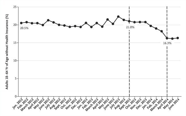
Yes, it starts before the ACA was implemented to give you a nice year+ baseline. The implementation of two stages of the ACA is clearly marked and shows an obvious drop in the percentage of uninsured.
Not sure what there is to misunderstand here?
As for your own link, it contradicts nothing in the graph.
Actually....its not the best graph, the latest numbers show that the number of uninsured has fallen even further.
Yes, it starts before the ACA was implemented to give you a nice year+ baseline. The implementation of two stages of the ACA is clearly marked and shows an obvious drop in the percentage of uninsured.
Not sure what there is to misunderstand here?
As for your own link, it contradicts nothing in the graph.
The ACA was implemented in 2012?
My link contradicts everything in your graph....
Please register to post and access all features of our very popular forum. It is free and quick. Over $68,000 in prizes has already been given out to active posters on our forum. Additional giveaways are planned.
Detailed information about all U.S. cities, counties, and zip codes on our site: City-data.com.

 Please register to participate in our discussions with 2 million other members - it's free and quick! Some forums can only be seen by registered members. After you create your account, you'll be able to customize options and access all our 15,000 new posts/day with fewer ads.


")

