Quote:
Originally Posted by MissionIMPOSSIBRU

Nice analysis. But can you address two ostensible problems in your reasoning?
|
Thank you, I shall endeavour to address your points.
Quote:
1. Why should welfare spending increase proportionately with GDP given a relatively stable population?
This is bearing in mind the UK GDP was £600 billion in 1993 and £1400 billion in 2010. When assessing changes in welfare dependency (ie. not simply as a macroeconomic factor) over this period, wouldn't it be more substantive to compare welfare spending in nominal or real terms per capita?
|
To compare welfare spending in purely nominal terms could lead to a bit of a problem. By that rationale, one could compare current welfare spending per capita in 2013 versus 1911 when the National Insurance Act was passed and ask why benefit claimants should be entitled to any more than 2 shillings and sixpence a week. I think including inflation in the calculation has to be a no-brainer.
Comparing the welfare spend in real per capita terms has more merit, and I'll do it for you, but I wish to note that this goes beyond the scope of the point that I was originally making. The point I was making is that we spend no greater a proportion of our national income on welfare payments in the midst of the worst recession in decades than we did in 1993. However, I'll bite and respond to your point anyway. I've taken 2009 as the year for comparison because it's the last year for which I could source all the available information to make the point, on the understanding that circumstances have not changed significantly since then. Here are the figures:
The numbers are thus:
UK population in 1993: 57.7 million (1)
UK population in 2009: 61.7 million (1)
Nominal Welfare spend in 1993: £48.5Bn (3)
Nominal Welfare spend in 2009: £99Bn (4)
Consumer Price Level in 2004 £ in 1993: 82.13 (2)
Consumer Price Level in 2004 £ in 2009: 110.83 (2)
(i.e. 28.7% increase in real consumer prices, note the consumer price index does not cover housing costs)
Firstly we're going to calculate welfare spending per capita and then compare them.
In 1993, welfare spending per capita (in nominal terms) was £840.55.
In 2009, welfare spending per capita (in nominal terms) was £1604.53.
Adjusting for inflation, £840.55 in 2009 £ equates to £1081.78
Ergo, the welfare bill in 2009 was 52% higher in real terms. That is where the Daily Mail would leave this story, and I presume this is the point you are alluding to. We're now going to examine why the Daily Mail et al are pandering to a falsehood by leaving this story here. The narrative the Daily Mail wish to spin is that this increase is the result of the burgeoning profligacy and laziness of the underclass. (I hope by your use of the term 'benefit dependency' that you haven't been duped into believing it!)
Here is where our welfare money goes:
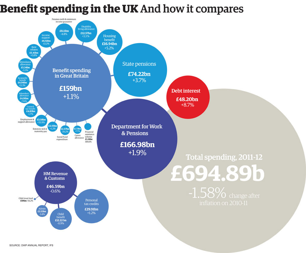
The above source is for the 2010/11 year but for our purposes it should be ok. You'll note that the largest single benefit (aside from state pensions) are Working & Child Tax Credits at £29.91Bn. Tax credits were introduced to eliminate the perverse incentive which previously existed, whereby somebody could actually be financially better off by living on benefits than taking a low-paid and/or part-time job. Though the tax credit system has flaws in its implementation, it has seen large-scale uptake. If you want to criticise the Tax Credit system be my guest, but for the purposes of the point I'm making here, the biggest single increase in the benefit bill between 1993 and the present has been towards
people who are working on low incomes. Furthermore, as those people are working, they are also a contributing factor to UK GDP growth between 1993 and the present.
To put this in its mathematical perspective, if the tax credit system had not been introduced, the welfare bill in 2009 would have been ~£30Bn lower, and GDP would have been commensurately lower also. That would take 2009's welfare bill down to ~£69 Billion. Remember, 1993's welfare bill was £45Bn, but inflation adjusted to 2009 £ that would be £57.9Bn. So now we're down to a gap of £11.1Bn in 2009 £, even without considering the adverse effects on the UK economy of those in receipt of tax credits who would not be working were that system not in place.
The second biggest benefit is Housing Benefit, the benefit that pays/helps to pay peoples rent if they are not working or are on a low income. You'll remember that in the inflation figures I described earlier, I noted that the Consumer Price Index (CPI) does
not fully take account of housing costs when calculating inflation. i.e.
Real Average House Price in Q1 1993: £89,366 (5)
Real Average House Price in Q1 2009: £175,525 (5)
House price inflation over this period has been 50.91% between 1993 and 2009, whereas consumer price inflation has only been 28.7%. Therefore, the Housing Benefit bill and the Rent Rebate bill (£16.94Bn and £5.45Bn respectively) are 22.2% more expensive in 2009 than in 1993
on top of the inflation adjustment carried out earlier. This represents another £5Bn of the increase in the welfare budget. This fact is exacerbated by the fact that since Right to Buy was introduced, Council's have all but stopped expanding their social housing portfolio's, and increasingly those reliant on benefits have to rent from the private sector at market rates. I can't find exact figures to illuminate that last point so I'm going to be extremely conservative in my estimation and assume that housing costs for benefit claimants have
only risen at the same rate as for everyone else.
The gap of £11.1Bn I mentioned before is therefore reduced to £6.1Bn after the above housing considerations. As the consumer price index doesn't consider Council Tax costs either, I'm sure I could squeeze another billion or so out of that. I reckon the ageing population probably leads to more people claiming for attendance allowance, carers allowance and disability benefits than was the case in 1993 and that would probably another few billion. I could point out that 1993 was something of an anomalous year, in that for reasons I could only guess at welfare spending was lower than in the 3 years before or after it, that would probably eek out another billion or so.
Effectively though, we're down to peanuts of a difference either way. That we spend more per capita on social welfare is not in question. However, the one thing we can rule out
entirely is that
any of this increase is down to factors that the Daily Mail would relish reporting on. We're spending more primarily because we subsidise people on low incomes into employment, which in turn boosts UK GDP; and secondly we spend more because we haven't built enough houses to keep prices in check.
Quote:
|
2. Why did you not consider interest rates when comparing national debt interest payments between 1993 and 2010?
|
I didn't discuss interest rates because it wasn't relevant to my conclusion. We spend substantially less servicing our national debt now than in 1993. That was my point, nothing more, nothing less. You may have noticed that I have something of a passionate loathing of the Daily Mail. To me the Daily Mail is more than a newsrag, it's an entirely debased way of thinking. There is a calibre of person who is genuinely convinced that the world is collapsing around him because other people are either:
A - Lazy (Benefit scroungers and Immigrants)
B - Corrupt (Bankers, Benefit Scroungers and Immigrants)
C - Inept (Politicians and Bankers)
D - Outright Belligerent (Muslims and Bankers)
This kind of person makes up about 50% of the posters on this wider forum. Admittedly we're spared a little bit in the UK forum but there are still clear culprits. One of the founding articles of faith amongst these morons is that we're burdened with so much national debt that everyone will be forced down the salt mines for 80 hours a week to pay it off. I therefore take glee in reporting that we pay less servicing this (insert Daily Mail superlative here) debt than we did in the past.
Eoin
(1)
http://www.populationmatters.org/doc...ion_growth.pdf
(2)
http://www.city-data.com/forum/unite...riesofdata.xls (Search for three centuries of data - bank of england in google if link doesn't work)
(3)
UK Central Government and Local Authority Spending 1692-2015 - Charts
(4)
UK Central Government and Local Authority Spending 1692-2015 - Charts
(5)
Graphs > Nationwide average house prices adjusted for inflation - HousePriceCrash.co.uk
 Please register to participate in our discussions with 2 million other members - it's free and quick! Some forums can only be seen by registered members. After you create your account, you'll be able to customize options and access all our 15,000 new posts/day with fewer ads.


