Please register to participate in our discussions with 2 million other members - it's free and quick! Some forums can only be seen by registered members. After you create your account, you'll be able to customize options and access all our 15,000 new posts/day with fewer ads.
This question is really around representation of your area to its long term statistics on a day-to-day basis. It is one of variation, susceptability to events such as La Nina, El Nino etc.
Having the key metrics of average daily min, max and sunshine does not always paint a full picture.
Ideally additional statistics such as:
a) average daily max temp variation,
b) standard deviation of the key metrics by month and year
c) quartile ranges of the key metrics
d) change over time of the key metrics
..etc could be useful.
Another way of asking this question is: "how consistent are your statistics when compared against the long term averages"?
In Sydney, our mean daily maximums in autumn and winter have smaller variation that the mean daily maximums in spring and summer. Anecdotaly I suspect our sunshine stats are more stable at these times of year as well.
I have also noticed that Sydney seems to be thrown out more by El Nino and La Nina, but again just my perception.
Also I've noticed here that the cloudy and sunny spells hang around for longer (i.e. we can have weeks of cloudy weather and also weeks of sunny periods - averaged out across the year these phenomena pass by unnoticed).
Also what characteristics of your climate get washed over by the standard key metrics?
Having access to around 55 years of Sydney weather data I am currently coding up some of these interesting sort of metrics to enrich the overall picture of this climate.
Let me know your thoughts and observations!
I find the stability of climates an interesting topic. I think it is one of the most important climate metrics. Average high is important, but more important to me is, what is the likelihood of experiencing that temp on a daily basis. I’m intrigued by what is the standard deviation of the daily min/max temps for any particular location.
In the USA, average to me has less meaning than the range of temps you're likely to encounter. Say the average high for Philadelphia is 39 in Jan, however very few days in Jan will actually hit a high of 39. What you are more likely to get is weeks of high 20's low 30's, then weeks of mid 40's. Of course each winter is different and therein lies another metric which is how far off is the monthly temp from average.
As I stated before, you can have a month that hits the average temps dead on, but within that month you can have really large temp variations. Same goes with monthly temps on a year on year basis. The last two winters here have been pretty cold. And looking at stats, it seems in the US we have large variations in avg monthly temps on a year to year basis. I don’t enjoy those large deviations, and that is why I would like Aus climates.
I think that is why every year there is such hype in this country for what the long term winter forecasts are. We absolutely never know what we are going to get.
This question is really around representation of your area to its long term statistics on a day-to-day basis. It is one of variation, susceptability to events such as La Nina, El Nino etc.
Having the key metrics of average daily min, max and sunshine does not always paint a full picture.
Ideally additional statistics such as:
a) average daily max temp variation,
b) standard deviation of the key metrics by month and year
c) quartile ranges of the key metrics
d) change over time of the key metrics
..etc could be useful.
Another way of asking this question is: "how consistent are your statistics when compared against the long term averages"?
In Sydney, our mean daily maximums in autumn and winter have smaller variation that the mean daily maximums in spring and summer. Anecdotaly I suspect our sunshine stats are more stable at these times of year as well.
I have also noticed that Sydney seems to be thrown out more by El Nino and La Nina, but again just my perception.
Also I've noticed here that the cloudy and sunny spells hang around for longer (i.e. we can have weeks of cloudy weather and also weeks of sunny periods - averaged out across the year these phenomena pass by unnoticed).
Also what characteristics of your climate get washed over by the standard key metrics?
Having access to around 55 years of Sydney weather data I am currently coding up some of these interesting sort of metrics to enrich the overall picture of this climate.
Let me know your thoughts and observations!
It really is a function of landmass and latitude. Worldwide most climates below 25 latitude have less devation from their normal means....middle latitudes (25 - 55) have the most....then in polar latitudes it drops again (60 -80).
Where I live hitting average temps in winter is uncommon. Much of the time, the average temp, especially the last few winters, have been 10-20 degrees below average for weeks at a time. Here in south-central PA, we're supposed to have an average high of 40-50 degrees in winter but these past few winters, 20-32 have been much more common. It all depends which direction the wind is coming in from, and how strong
My climate follows the temperature averages much more closely than most mid-latitude climates. To give you an idea of the last week (which I admit has followed the averages more than normal) the typical is something like 11/4 (C), and what we got was: 11/4, 13/6, 12/5, 14/8, 11/2, 12/1, 12/6, and this is a transition season, where we supposedly get more variation than normal. Generally if we get daily highs more than 4C above or below average it's rare enough to be comment-worthy. 10C away from the averages and records start falling.
Over a longer term, this site gives the Central England Temperature anomalies compared to the 1971-2000 averages for every month since 1660 (though it's five years out of date): and you'll see the vast majority of months in living memory are within 2C of the norm. Last December was -5.8 below average, and the third biggest anomaly in the last 100 years. From 1965 to 2005 only one year was more than 1C above or below the mean, and that only by .01C.
The rainfall and sunshine totals are more variable than the temperatures, though if I went into that properly I'd be up all night. This table below gives the sun totals averaged over England and Wales. The oddest results at first glance are February 2008 being sunnier than August 2008 (August should have 2-3 times more sun) and March 1995 being two and a half times sunnier than March the next year:
In maritime New Zealand monthly mean temperatures don't deviate from the normal by anywhere near as much as in continental places away from low latitudes. The hottest month ever nationwide (relative to the norm.) was only about 2.8C above the average.
Rainfall shows wider variability, especially in the comparatively dry eastern regions, but not at a level comparable with most of Australia. Cloudy months have occasionally had large deficits of sunshine in some places, the sunniest months generally less so. The township of Waimate, in an area where summer is quite a bit cloudier than winter in relative terms, was referred to in an older thread (it had a year where its record high June sunshine of 161 hours was followed by a December with just 60!)
My climate follows the temperature averages much more closely than most mid-latitude climates. To give you an idea of the last week (which I admit has followed the averages more than normal) the typical is something like 11/4 (C), and what we got was: 11/4, 13/6, 12/5, 14/8, 11/2, 12/1, 12/6, and this is a transition season, where we supposedly get more variation than normal. Generally if we get daily highs more than 4C above or below average it's rare enough to be comment-worthy. 10C away from the averages and records start falling.
Over a longer term, this site gives the Central England Temperature anomalies compared to the 1971-2000 averages for every month since 1660 (though it's five years out of date): and you'll see the vast majority of months in living memory are within 2C of the norm. Last December was -5.8 below average, and the third biggest anomaly in the last 100 years. From 1965 to 2005 only one year was more than 1C above or below the mean, and that only by .01C.
The rainfall and sunshine totals are more variable than the temperatures, though if I went into that properly I'd be up all night. This table below gives the sun totals averaged over England and Wales. The oddest results at first glance are February 2008 being sunnier than August 2008 (August should have 2-3 times more sun) and March 1995 being two and a half times sunnier than March the next year:
You live in a very stable climate temp wise. I happen to like that. Just imagine a winter where your daytime high will almost always either be 10 to 15 in either direction from the average. I don't find it exciting, I find it frustrating.
NYC weather is closer to average than most other locations in eastern US. This is due to its coastal position and the urban heat island. On the days you see news reports of frosts in Florida and snow in the Deep South, you might think NYC is the new Winnipeg. In reality the coldest it has been in the past couple of winters (which were unusually cold) was about 6F. Which is really cold but only about 20F below average lows. In comparison, a frost in central Florida means temperatures over 30F below average lows.
NYC weather is closer to average than most other locations in eastern US. This is due to its coastal position and the urban heat island. On the days you see news reports of frosts in Florida and snow in the Deep South, you might think NYC is the new Winnipeg. In reality the coldest it has been in the past couple of winters (which were unusually cold) was about 6F. Which is really cold but only about 20F below average lows. In comparison, a frost in central Florida means temperatures over 30F below average lows.
No doubt your right…NYC has several advantages for keeping temps more in line with long term averages…namely a massive urban heat Island!
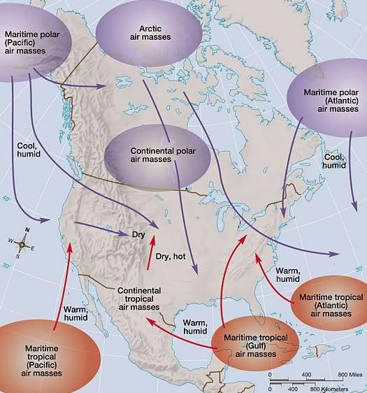
However, the prevailing air masses that surround the USA give a distinct advantage to the ocean margins of the mainland…and a disadvantage to the interior. Oceanic air masses, whether maritime polar or maritime tropical…are more moderate in their nature. Since maritime air masses hang out more on the margins of the mainland...they tend to help keep averages closer to the long term means on the margins of the USA. You know the case with NYC - once the polar front/jet moves northward after late April...the sun is in control untill late September, and the Bermuda High is really the only air masses than ebbs and flows. The interior however, can still see modest cold and deep tropical heat since the air masses that effect the interior are more continental more often. Continental tropical air is the hottest type of air mass that effects the USA...and Arctic air masses from far northern Canada are the coldest. I thought this was a cool map that showed the concept. Notice how these two almost meet in the interior:
.
Last edited by wavehunter007; 03-16-2011 at 07:56 PM..
Please register to post and access all features of our very popular forum. It is free and quick. Over $68,000 in prizes has already been given out to active posters on our forum. Additional giveaways are planned.
Detailed information about all U.S. cities, counties, and zip codes on our site: City-data.com.

 Please register to participate in our discussions with 2 million other members - it's free and quick! Some forums can only be seen by registered members. After you create your account, you'll be able to customize options and access all our 15,000 new posts/day with fewer ads.