Losing Earth: The Decade We Almost Stopped Climate Change (solar, global warming, LED)
Please register to participate in our discussions with 2 million other members - it's free and quick! Some forums can only be seen by registered members. After you create your account, you'll be able to customize options and access all our 15,000 new posts/day with fewer ads.
Among their other failed predictions-- 10 ft rise in oceans. We've only got a 2mm/yr rate of rise and most of that is due to rising tectonic plates as they rebound during this interglacial period. https://www.dailymail.co.uk/sciencet...fluctuate.html Note the map near the end of this article-- many areas show falling ocean levels. It's plate tectonics, not temps.
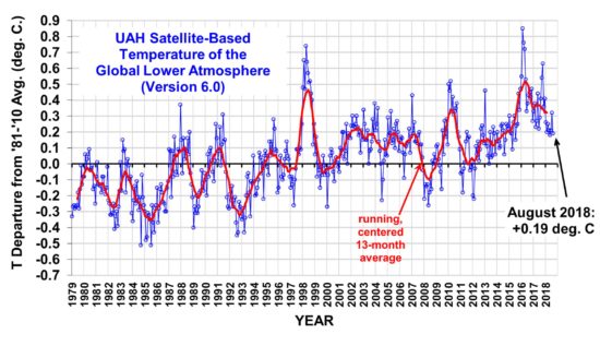
Since the poster in the above response didnt mention the source, I just want to point out that the graph below comes from the conservative blog Whats up with that (WUWT).
Notice that temperature change from balloon and sat data sheets of maybe .2C from 1980 to 2015
This is an interesting read as it ranges from predictions made all the way back to 1975 (43 years ago).
You should take a look as there are many IPCC predictions made over a range of time. The conclusion made is:
Quote:
Climate models published since 1973 have generally been quite skillful in projecting future warming. While some were too low and some too high, they all show outcomes reasonably close to what has actually occurred, especially when discrepancies between predicted and actual CO2 concentrations and other climate forcings are taken into account.
Models are far from perfect and will continue to be improved over time. They also show a fairly large range of future warming that cannot easily be narrowed using just the changes in climate that we have observed.
Nevertheless, the close match between projected and observed warming since 1970 suggests that estimates of future warming may prove similarly accurate.
Check the graph of Spencer's data that you posted-- 2014 (the extent of the graph I posted) shows the same 0.2 deg anomaly as yours.
I had checked accurately the first time. You must have missed that one plot started at zero and the other at -.2.
The graph you posted that was hosted by the conservative blog starts at zero C in the late 70's and ends around .2C around 2014.
The UAH plot from Spencers blog starts in the same time frame at - .2C (note the minus sign) and rises to about + .2C. Well.. that is a total change of .4C.
If I look at the other plot showing RATPAC (balloon) and RSI (satellite and note the correlation between the satellite and balloon data), I actually see a change of .6 C.
So the plot you showed and is hosted on WUWT shows between 1/2 to 1/3 of the temperature change of the plots in the references I produced. Maybe you have the actual reference from where your plot came from?
Spencer's data plot clearly states that 1980-2010 average was used as baseline, so 1981 was -0.2deg while the other graph doesn't state the how the baseline was derived, but they obviously chose a value that gave 1980 at the baseline. Same data, different baseline. The point remains: the Warmists failed to predict "The Pause." It remains to be seen if it's really a pause and warming will pick up again, or if it's a change in direction.
In regards IPCC & sea levels- they're a political body masquerading as a scientific institution. It means nothing if they don't mention plate tectonics in their writings. They eventually admitted, don;t forget, that their tirade about the melting glaciers in the Himalayas had only one corroborating article: a popular mag piece by a "science journalist" using no data whatsoever. They were publicly embarrassed and removed that part in subsequent versions.
I don't know who did the cipherin' in that 5th IPCC graph, but the mean is shown as rising steadily from 1998 to 2015, although you can eyeball the tempo plots and see it should clearly be flat from '99-'15 and then rise sharply again (that's when they "adjusted" the data--again.)
If ocean rise is due to thermal expansion & melting ice, why are some areas showing falling levels? Subduction of plates in certain areas would explain it. The other problem is we need an operational definition of "sea level." Tide gauges anchored in the bedrock by in harbors don't seem to show it. Satellites measure the distance from sea surface to their orbits. they show it-- that tells us the surface is closer to the satellite, but says nothing of ocean depth. These two diverging observations are consistent with a tectonic explanation. Glacial melt is occurring in some ranges and may account for some sea rise, but some ranges are increasing ice and Antarctica is accumulating ice, so that should be close to a neutral factor. Melting sea ice is not a factor: your mint julep never overflows when you ignore it and the ice melts-- the level remains constant.
Last edited by guidoLaMoto; 09-27-2018 at 03:38 PM..
Please register to post and access all features of our very popular forum. It is free and quick. Over $68,000 in prizes has already been given out to active posters on our forum. Additional giveaways are planned.
Detailed information about all U.S. cities, counties, and zip codes on our site: City-data.com.

 Please register to participate in our discussions with 2 million other members - it's free and quick! Some forums can only be seen by registered members. After you create your account, you'll be able to customize options and access all our 15,000 new posts/day with fewer ads.