Please register to participate in our discussions with 2 million other members - it's free and quick! Some forums can only be seen by registered members. After you create your account, you'll be able to customize options and access all our 15,000 new posts/day with fewer ads.
Saw on Blues' Twitter that they'll bring back their '90s sweaters for a couple games this season. It looked like the ones w/significant red wraparound on the bottom..
Known affectionately (or not) as the “clown jerseys” in STL.
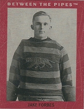
Very cool hockey history.
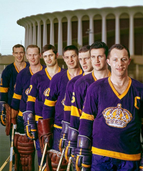
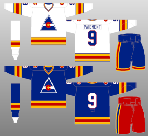
Two, u posted, I have stronger opinions on: old Colorado Rockies sweaters were cool, I like how they incorporated their state flag. But don't like all the stripes on legs..
Conversely, I disliked the early Coyote jerseys. I thought the Coyote was too blocky & busy. They tried using too many colors & patterns on their sweater. My opinion, the best looking uniforms/logos are (generally) simple & stronger (ie- the basic Rangers shield, Red Wings red & white, etc). Peace.
Very cool hockey history.
Two, u posted, I have stronger opinions on: old Colorado Rockies sweaters were cool, I like how they incorporated their state flag. But don't like all the stripes on legs..
Conversely, I disliked the early Coyote jerseys. I thought the Coyote was too blocky & busy. They tried using too many colors & patterns on their sweater. My opinion, the best looking uniforms/logos are (generally) simple & stronger (ie- the basic Rangers shield, Red Wings red & white, etc). Peace.
Maybe you would like the Rockies' blue jersey from the previous season a bit more - no horizontal stripe on the pants for that uniform.
Call me prejudiced if you will but, the Blackhawks have the best sweater/jersey in sports.
I’m a Blues fan, and even I have to admit it’s pretty fantastic. Not a fan of the black alternates the Hawks wore the other night when the Blues shut them out. Much prefer the black alternate that mimicked the red jersey logo/stripes.
I’m a Blues fan, and even I have to admit it’s pretty fantastic. Not a fan of the black alternates the Hawks wore the other night when the Blues shut them out. Much prefer the black alternate that mimicked the red jersey logo/stripes.
Since the last reorganization, the Blues have replaced the Red Wings as the Blackhawks' chief rival. And that's fine by me, as that matchup always guarantees a hard fought battle from both sides.
As for the sweaters, I like that the logo and sweater have changed very little since about 1955, before that, yeah stripes were the thing!
Boy I don’t know...even prior to the last realignment, the Blues vs Hawks had some nasty battles and history. The old Norris aka “Black and Blue” Division was something.
Please register to post and access all features of our very popular forum. It is free and quick. Over $68,000 in prizes has already been given out to active posters on our forum. Additional giveaways are planned.
Detailed information about all U.S. cities, counties, and zip codes on our site: City-data.com.

 Please register to participate in our discussions with 2 million other members - it's free and quick! Some forums can only be seen by registered members. After you create your account, you'll be able to customize options and access all our 15,000 new posts/day with fewer ads.