Please register to participate in our discussions with 2 million other members - it's free and quick! Some forums can only be seen by registered members. After you create your account, you'll be able to customize options and access all our 15,000 new posts/day with fewer ads.
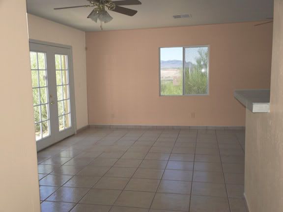
Went to a paint store that does free color consultations and this is what they came up with. I haven't decided whether I like it or not. The neutral color isn't off white like it looks in this picture. It's more of a light cool beige.
It's difficult to see the exact color on a computer monitor and it does look white in the first option. Try color samples in a very light beige or sand with a just a hint of pink in it and a sage which is a shade or two darker. The two accent walls look good IMHO and the entertainment center should be the focal point. Take home the samples and try them on your walls in all light especially in the corner that meets the accent wall.
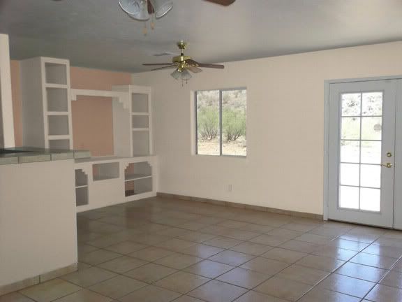
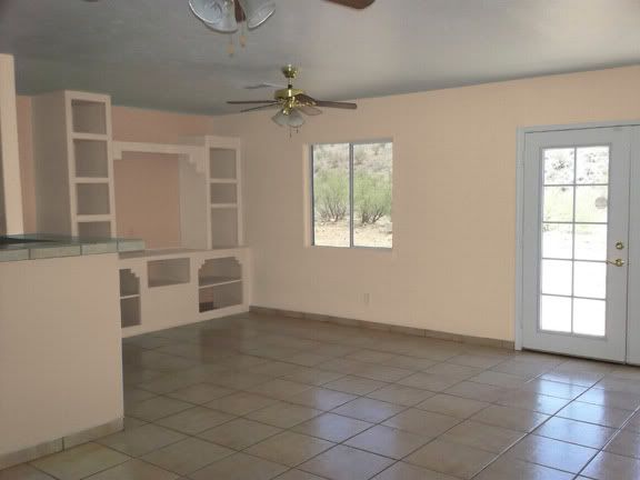
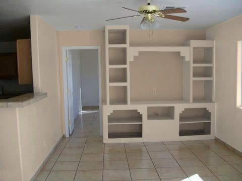
That has a very open, beachy feel to me. On the 4th picture. I would paint the wall to the left of the entertainment center and along the kitchen that same as the rest of the walls though. I wouldn't leave it the same color as the entertainment center. Again though, until you know what you will be using for furniture, I would hesitate to paint. It is a LOT easier to match paint color to furniture than it is to match furniture to paint.
Unless the paint job you have now is really bad, you will regret changing anything. You have neutral colors on the walls; color your room with the furnishings. I absolutely hate the colors people are coloring their homes with now. After housekeeping for 47 years and going into retirement, we are using neutral for all walls, bathrooms, etc. and using furnishings for the color scheme. I can now change the entire color of my bedroom by buying two drapes (4 panels) and a bed spread.
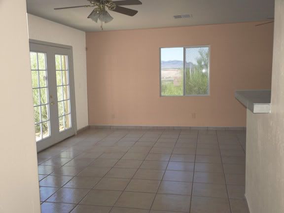
IMO having very light, neutral decor (sofa, floor tiles, carpeting) and pale pastel accessories need wall colors with a little more oomph to make things pop. I was thinking of wall color/trim more like the photo below and something in a bit of a deeper green for the accent wall. (It would look lighter & brighter in your house than in this picture, because your floor is much lighter.)
I don't care for the pic with the curtains at all, but you're the one who has to be happy with it.
I know this isn't your style or colors, but this is what I meant by using something as an inspiration piece.
I have a beige tone-on-tone sofa and my living room will be done in a predominantly brown & beige jungle theme. We recently moved and we're using the sofa we already have, so that is what we have to work with. At this point all the walls & ceiling are plain white and the wall-to-wall carpeting in the living room is pretty much the same color as the sofa. There is a doorway leading to the eat-in area of the kitchen off there, so those two rooms have to coordinate. The kitchen cabinets are chocolate brown and the countertops and floor in the kitchen are light and neutral.
Everything is bland and colorless, so I need an inspiration piece. We already have a very large picture for over the sofa, but it's an animal print montage. While striking, it's done in various shades of brown and beige, with a tiny touch of black, so it's also neutral.
Since we already have the very large picture and I like putting an area rug over wall-to-wall to define a seating area, I selected an area rug that I think would work well in the space and be "different" from, but not clash with the jungle theme. (I don't want to overdo it.)
This attached pic is of the area rug I just ordered. I think the little bit of green in the rug will play nicely off the plants in the room. I plan to look for a couple of throw pillows in the color I'm choosing for the fireplace wall, to toss onto the sofa. I already know all the colors I'm choosing will work well together, because they work well together in the rug.
Again, I know this isn't your style or colors. I wanted to illustrate how I'm using an inspiration piece to pull together the rest of the room (and the kitchen, as well). Of course, the designers may think this is horrid, but we're the only ones who really have to love it.
Thanks, CheyDee. I like what you're doing with your house. Do you know what the name of the color is on the walls in the first picture? I think that color might work for me.
Thanks. Now I just have to hope the colors on my monitor are close to the actual rug colors, so I still like it when it gets here. LOL
Sorry, I do not. That is a pic from a house a friend recently bought and the walls were already painted that color. You can see there is a much greater difference between that wall color and light trim, compared with the wall color recommended by the paint store.
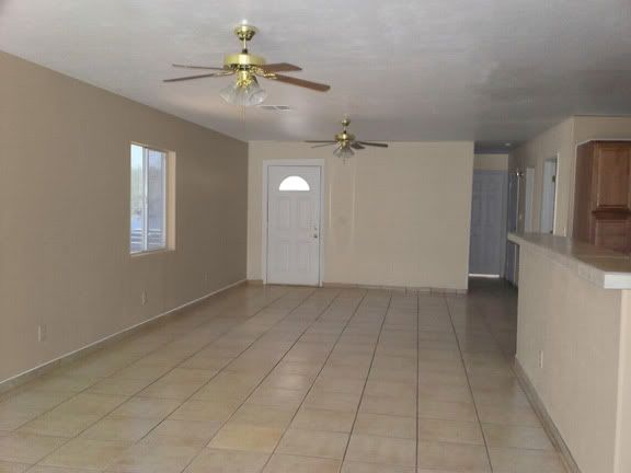
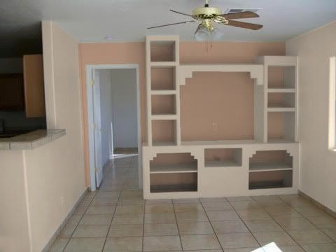
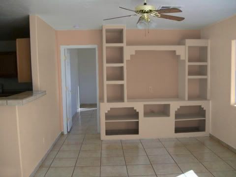
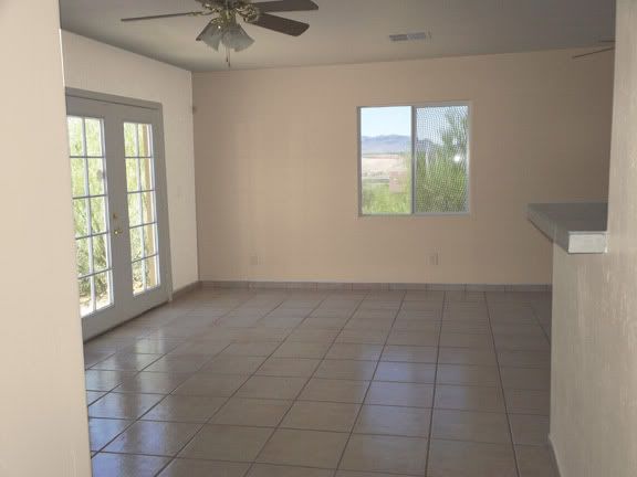
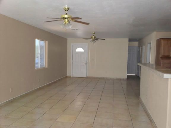
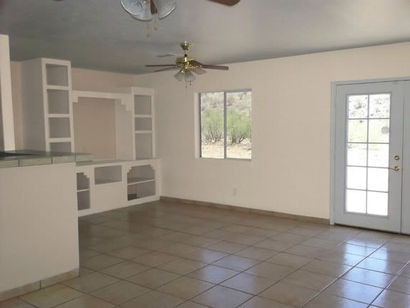
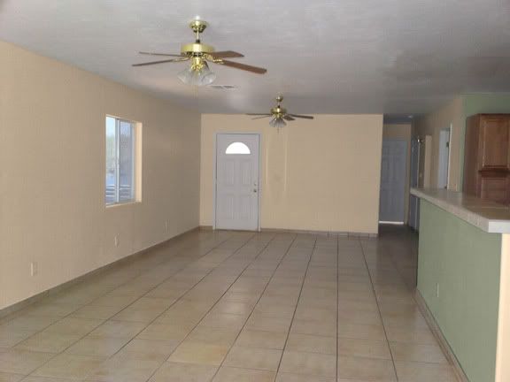
Had another free color consultation done today. Here's what they came up with.
The first is a "safe" neutrals from the same color strip. Floating Feather with Almond Latte accents.
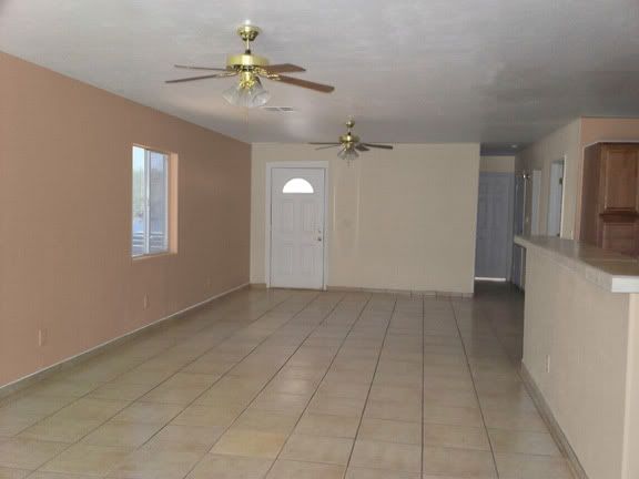
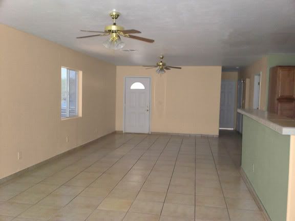
Next is Floating Feather with Field of Wheat accents. The accent color isn't as pink in real life as it is here.
This is Travertine with Field of Wheat accents.
Floating Feather with Travertine accents.
And a couple more with a green kitchen. First one is Almond Latte with Fair Spring. Second one is Terracotta with Fair Spring.
Please register to post and access all features of our very popular forum. It is free and quick. Over $68,000 in prizes has already been given out to active posters on our forum. Additional giveaways are planned.
Detailed information about all U.S. cities, counties, and zip codes on our site: City-data.com.

 Please register to participate in our discussions with 2 million other members - it's free and quick! Some forums can only be seen by registered members. After you create your account, you'll be able to customize options and access all our 15,000 new posts/day with fewer ads.