Please register to participate in our discussions with 2 million other members - it's free and quick! Some forums can only be seen by registered members. After you create your account, you'll be able to customize options and access all our 15,000 new posts/day with fewer ads.
"Feb. 20 (Bloomberg) -- A glitch in satellite sensors caused scientists to underestimate the extent of Arctic sea ice by 500,000 square kilometers (193,000 square miles), a California- size area, the U.S. National Snow and Ice Data Center said."
"Feb. 20 (Bloomberg) -- A glitch in satellite sensors caused scientists to underestimate the extent of Arctic sea ice by 500,000 square kilometers (193,000 square miles), a California- size area, the U.S. National Snow and Ice Data Center said."
good luck with an honest answer from him on that one. I spent several threads over a year ago trying to get him to answer to problems with the surface stations.
Ever is a long, long time. So are the time scales of climate change. 1,000 years is climatology. 100 years is weather. 2 years is nothing.
Agreed.
When a global warming alarmist wants to provide legitimate scientific data to prove man-made global warming is occurring at an unprecedented rate, they will jump on the documented temperature readings, because the thermometer was invented smack dab in the middle of the frigid temps of the little ice-age. Creating a temperature graph that uses the frigid cold of an ice-age as a reference, will correctly depict a warming trend, as the earth warmed out of it.
Then they will jump right to satellite data, which became available smack dab at the end of another bitter cold period of the 1970s. This is when scientists were claiming a new ice-age was coming.
Both sources of data became available during unusually cool periods in recent history, and can then be used to create a starting point for graphs and visual images to demonstrate an unusual warming trend, and then blame it all on human activity.
If we had 10,000 years worth data containing documented temperature readings and satellite data, it would show a natural cycle of warming and cooling, and all this man made global warming hype would look like so much noise.
An excuse? for what? That nature is variable? Where do you live? Is it the same temperature outside every morning? Do you have an excuse for that?
too bad you don't even know what you just responded to, your post proves it. So now that they found this massive ice sheet this year that was thought to have not existed, what is the percentage of ice cap gone?
too bad you don't even know what you just responded to, your post proves it. So now that they found this massive ice sheet this year that was thought to have not existed, what is the percentage of ice cap gone?
You didn't answer the question. Too hard for you?
To answer yours. Summer minimums in the Arctic are in the 4-6 million sq km range compared to a winter maximum of about 14-16 million sq km. I let you work out the math.
When a global warming alarmist wants to provide legitimate scientific data to prove man-made global warming is occurring at an unprecedented rate, they will jump on the documented temperature readings, because the thermometer was invented smack dab in the middle of the frigid temps of the little ice-age. Creating a temperature graph that uses the frigid cold of an ice-age as a reference, will correctly depict a warming trend, as the earth warmed out of it.
Then they will jump right to satellite data, which became available smack dab in the middle of another bitter cold period of the 1970s. This is when scientists were claiming a new ice-age was coming.
Both sources of data became available during unusually cool periods in recent history, and can then be used to create graphs and visual images to demonstrate an unusual warming trend, and then blame it all on human activity.
If we had 10,000 years worth data containing documented temperature readings and satellite data, it would show a natural cycle of warming and cooling, and all this man made global warming would hype would look like so much noise.
Well, there is the ice core data which shows something similar to what you are saying.
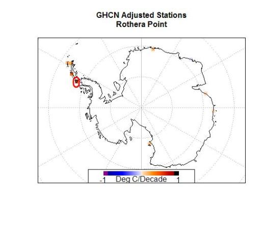
So as we can see, of all the stations available in the antarctic, GHCN has chosen to use a single station on the Antarctic Peninsula to represent an entire continent of the earth for the past 17 years (red circle). But it’s not just any station, it’s a special one. Rothera Point has the single highest trend of any of the adjusted station data.
To answer yours. Summer minimums in the Arctic are in the 4-6 million sq km range compared to a winter maximum of about 14-16 million sq km. I let you work out the math.
That answers nothing because you have no answer. I'll give you an E for effort, remember, in today's liberal society everyone gets a trophy, even if you lose!
That answers nothing because you have no answer. I'll give you an E for effort, remember, in today's liberal society everyone gets a trophy, even if you lose!
It answer the original OP question. The sea ice in the Arctic is melting and at the current rate we will soon see ice free summers. Perhaps as soon as Al Gore predicts or perhaps a bit later. The trend is clear for all to see. Anyone with a modicum of education can see the trend in the data.
That answers nothing because you have no answer. I'll give you an E for effort, remember, in today's liberal society everyone gets a trophy, even if you lose!
Please register to post and access all features of our very popular forum. It is free and quick. Over $68,000 in prizes has already been given out to active posters on our forum. Additional giveaways are planned.
Detailed information about all U.S. cities, counties, and zip codes on our site: City-data.com.

 Please register to participate in our discussions with 2 million other members - it's free and quick! Some forums can only be seen by registered members. After you create your account, you'll be able to customize options and access all our 15,000 new posts/day with fewer ads.