Please register to participate in our discussions with 2 million other members - it's free and quick! Some forums can only be seen by registered members. After you create your account, you'll be able to customize options and access all our 15,000 new posts/day with fewer ads.
Okay, when it comes to NFL and college football uniforms, I am the equivalent of the old man sitting on his stoop and yelling "get off my lawn!" When I first saw what Nike did to the Seahawks uniforms all I could say was, "What happened?" When Nike made a few tweaks to the Broncos uniforms I was little disappointed. I didn't like the batwing look (thankfully they fixed it for this season and the uniforms look decent again) and the leg stripes are downright comical now that they extend out across the front of the knees. Of course, after seeing what Nike did the Seahawks, I should be thankful the Broncos basic pattern escaped relatively unscathed.
Then we have the Jaguars new uniforms. I watched them play a preseason game and actually determined I didn't dislike them. And the Jags can get away with a design change because they are a franchise with virtually no tradition. Still, they botched up the helmets big time! That black/gold fade is just...awful. I think they should have gone with gold, actually. Only two other teams use gold helmets and the Jags colors combined with gold would have been unique.
For a team with little else going for it, I think the uniform swap may be the biggest event of the year. I hope the two-tone helmet doesn't catch on, though. I can't say how badly I hate that thing.
What say you? Are you a little less of a traditionalist when it comes to uniforms?
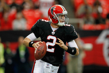
I agree with that list ..... I definitely prefer the Falcons with the red primary on the helmet as opposed to the Glanville all blacks
I really like the Pats old style - it's improved a lot with age and works better with the modern materials than it did before
I think these should be the eagles jerseys - complete with the bird w/football logo .... my wife was watching an NFL Films segment with me and was floored - why don't they wear those anymore?!
I like the new Seahawk uniforms. I do not like the new Jags unis. The old Jags unis were some of my favorites, they are going in the wrong direction on this one.
I would love to see the Broncos wear those old uniforms at least twice a year. Wear the old orange once at home and the old whites once on the road. Were the orange for a home date with the Raiders and the whites for a road game with the Browns if applicable.
I do like the Broncos current uniform, but it was not popular back when they made the switch. That they ever were predominantly blue when they could have been wearing orange is shameful! I'm glad they finally fixed that.
The Jags uniforms are the most hideous things in the entire football world that I've seen. Fixing that helmet would go a long way. It's so gimmicky.
Agree on the helmet, but as long as the Oregon Ducks and Seattle Seahawks are around, the Jags aren't even in the running for most hideous in the football universe!
Proabably my biggest hangups are the wide green stripe on the blue pants and the green blob that only seems to frame the "swoosh" on blue sleeve ...... I don't like not having the seahawks logo on the actual jersey, but get that the whole uniform is designed to be the totem
I like the blues a lot better when paired with the gray pants
As for the Jags - I thought the jerseys had potential but I was skeptical of the helmets .... the jerseys don't seem to look as good on as they did stand alone in pictures ..... the helmets are just awful, it's not a fade or a gradiant from black to gold - it's an abrupt change ...... on a far away view it provides an effect that is unique, but honestly looks more like a black birds beak than anything
Watched Jags v Eagles - The thing with the two tone helmet - it's the flat black fading into the shiny gold. Maybe glossy black would look better. In principle - helmet should remain pretty basic in its color.
Agree w/ the Eagle look above. The current version isn't bad - just like the late 80's/90's version better.
it doesn't really fade though - it just starts/stops
Please register to post and access all features of our very popular forum. It is free and quick. Over $68,000 in prizes has already been given out to active posters on our forum. Additional giveaways are planned.
Detailed information about all U.S. cities, counties, and zip codes on our site: City-data.com.

 Please register to participate in our discussions with 2 million other members - it's free and quick! Some forums can only be seen by registered members. After you create your account, you'll be able to customize options and access all our 15,000 new posts/day with fewer ads.