Please register to participate in our discussions with 2 million other members - it's free and quick! Some forums can only be seen by registered members. After you create your account, you'll be able to customize options and access all our 15,000 new posts/day with fewer ads.
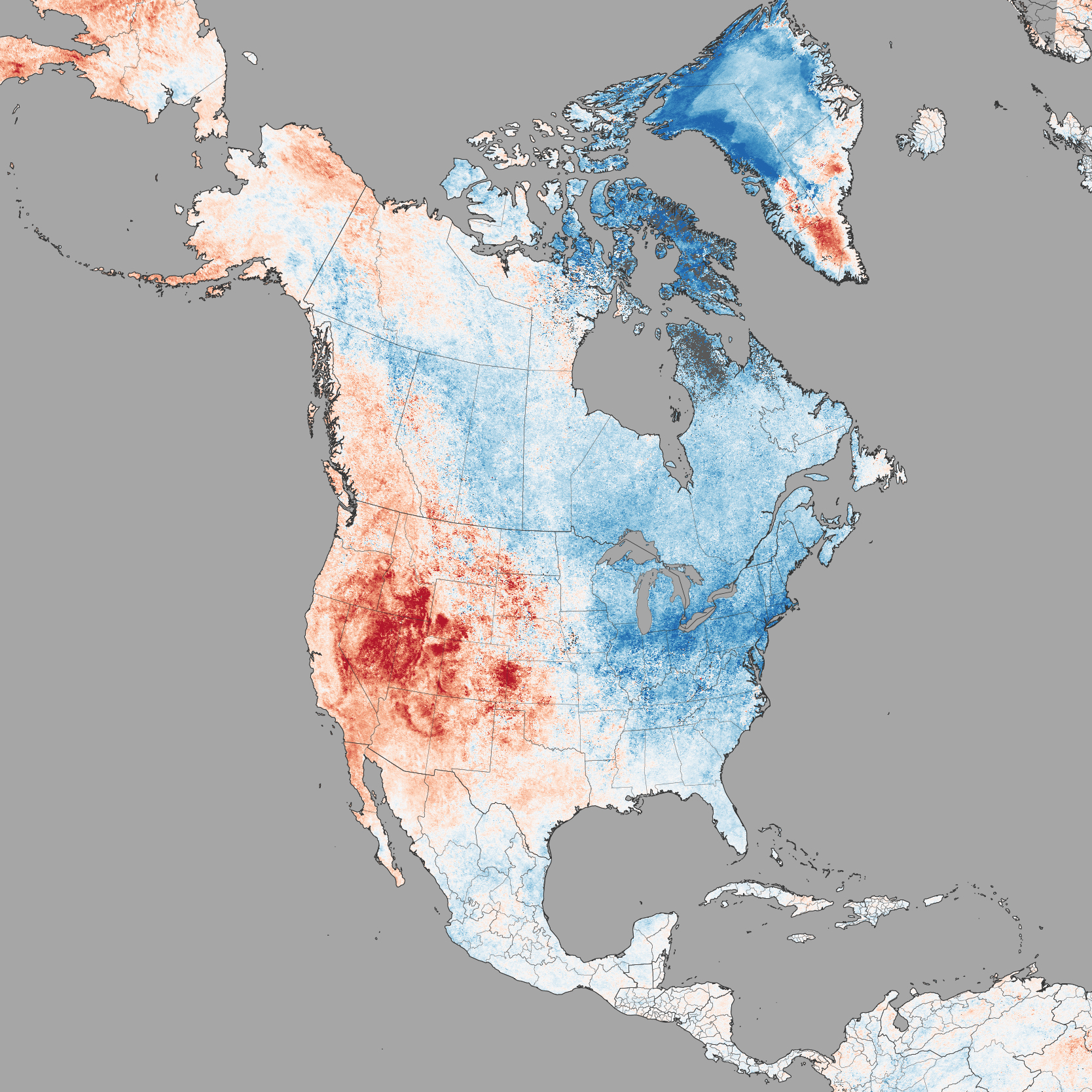
The warm west vs cold east led to a big west-east temperature gradient. Boundary was over the Great Plains, so some very steep temperature contrasts over flat land. Look at the contrast. Averaged above 30°F in central Montana, 5-10°F at the same latitude in North Dakota:
Pacific warm and cool pools have shifted since last winter (2013-14). Yet the result was the same: COLD EAST, MILDER WEST
By New Year Day, people were wondering where this cold winter was we had outlined in our outlook back in late October. I kept telling people on Facebook and Twitter to be patient. The cold is coming and when it does, it will harsh and similar to the year before. Guess what happened in January? The slow turnaround toward ARCTIC COLD began across the eastern US.
By February, the arctic floodgates had opened across the eastern 1/2 of North America. It was ALL-TIME COLDEST February in Cleveland (And many other areas in 100+ yrs on record) since weather records began in 1871.
Here are three graphs I made of monthly winter deviations. There's a common perception on this forum that northern US climates are extremely variable. For daily variability in the winter, that's accurate. But monthly variability? I looked at two other Europeans cities posters are from, that I would have assumed would have less monthly variability than my town. A station [Amherst] nearby me has data from 1836. I got it from Berkeley Earth [click on data table]. I used the adjusted data, which is adjusted to agree better with nearby stations and removed observations that may be of poor quality. I made a Q-Q plot of the distribution of January and February anomalies for Amherst. January and February have similar but statistically significant different standard deviations, so this isn't quite right. But I wanted more data points so used both months.
What's a Q-Q plot? A Q-Q plot compares the observed data to what the data would be if it followed a normal distribution. The dashed line is what a normal distribution with the same mean and standard deviation would follow. The y-axis is anomalies in °C. The x-axis is labelled "z quantiles". The z distribution is another name for the normal distribution. Quantiles refer to breaking down the data in order, similar to percentiles. 68% of the values are between -1 and +1, 95% between -2 and +2. For the normal distribution line, a point at -2 also has a standard deviation of -2. Looking at the graph, you can see outside the extremes, monthly January / February temperatures follow a normal distribution closely. But the coldest and warmest 2.5% do not. The warmer months less extreme than you'd expect if it were from a normal distribution, the colder months seem a bit off but a pattern isn't that clear. The skew shows it's harder to get extremely warm winter month than extreme cold ones; to compensate warmer than average months must be more common. If I had just look at February, I'd find that the most extreme months tend to be colder than a normal distribution. The data ends at Nov 2013, so the most recent February isn't shown. It's nearly tied with the coolest February on record which is the X on the lower right corner. At some point I might see I might calculate if I can do an estimate of how often a winter month that cold would occur. Now let's look at Paris:
The skew is much more obvious, leaving a normal distribution past ±1 standard deviations. For Amherst, the points past a normal distribution are so few it's hard to prove it's not normal. Note the scale on the y-axis is the same as Amherst; the monthly variability is about the same despite it being more of an oceanic climate. Now Helenski:
Similar skew to Paris, the monthly variability is higher. I had to stretch the y-axis to ±12, rather than the ±8 used. For both Paris and Helsinki, I used city reconstructions as the website didn't have a single station with temperature data going back that long. Only looked at data since 1870, as older years had too much uncertainty. Interestingly, January and February had almost the same exact standard deviation for Paris. None of the x-axes go past ±3, since it's going by percentiles, there aren't enough data points to reach that range (would need at least 400).
Why are Paris and Helsinki skewed but Amherst almost skew-less? For both Paris and Helsinki, mild weather comes from the ocean, which isn't that variable. Cold comes from the east, which especially for Helsinki is deep in a northern continent and capable of making it much colder. Amherst on the other hand, is open to land from both the north and south, so the variability is similar.
======================
Another website did similar stuff for the Russian heat wave:
Shhh. You're not supposed to point out the western warmth, or the warmth in the rest of the world. We are going into a new ice age because eastern North America is cold. If you read Bastardi, cold lover crackpot that he is, he rarely ever brings up the west or anywhere else in the world that is warm.
Shhh. You're not supposed to point out the western warmth, or the warmth in the rest of the world. We are going into a new ice age because eastern North America is cold. If you read Bastardi, cold lover crackpot that he is, he rarely ever brings up the west or anywhere else in the world that is warm.
Because he's a global warming denier, that's why.
Please register to post and access all features of our very popular forum. It is free and quick. Over $68,000 in prizes has already been given out to active posters on our forum. Additional giveaways are planned.
Detailed information about all U.S. cities, counties, and zip codes on our site: City-data.com.

 Please register to participate in our discussions with 2 million other members - it's free and quick! Some forums can only be seen by registered members. After you create your account, you'll be able to customize options and access all our 15,000 new posts/day with fewer ads.