Decorating around an enormous art piece (panels, painter, sand, photos)
Please register to participate in our discussions with 2 million other members - it's free and quick! Some forums can only be seen by registered members. After you create your account, you'll be able to customize options and access all our 15,000 new posts/day with fewer ads.
OP, I keep looking at looking at this, and trying to figure out what bugs me about it. I think its the distance from the crown molding more than anything else. The ceiling seems like its a standard height and the crown looks like a nice 3 piece. I feel like it needs some breathing room between the graphic element of the crown and the graphic element of the frame.
I see a lot of oversized murals with a really stylized look that are popular. They typically seem to work best behind a sofa, headboard or other large piece of furniture-- like this:
But they are not framed and just sort of flow across the wall. Your sign has a very hard start/stop with the darker edges. Could you maybe put a long low buffet in front of it with some objects that break it up a little? Like some things that stick up over the frame and soften the edges a touch?
Given the side of the table, there's not really room to put anything in front of it. I was thinking about a nice tree or something in the corner or perhaps both of them on either side of the sign. It does really need some kind of softening.
I'm trying to figure out if I don't have to remove the chair rail although I did bring this up this to hubby and got a pretty definite no. He wants me to try other stuff first (like curtains, etc) before contemplating this. I get it - it was hard, very hard, for us to put up as we had to build a temporary support to lag bolt it into the wall.
Well, I agreed to add the curtains and a couple of other pieces first so we'll see. I suspect I am going to need to make an adjustment down the road. Trust me, I understood the placement issue right off but was hoping to work around it.
Your intuition is correct. You are probably going to make changes down the line because you know what the problem is. Even if an observer cannot consciously articulate the issue, he/she can immediately tell something about placement of the sign is off. It has nothing to do with color, texture, or your choice of furnishing.
If you are going to live with this placement for a while, I would advise against anything that brings out the crown moulding or the chair rail. I like white walls and would paint the chair rail and crown moulding the same white to disguise them. The next thing you might consider is breaking up the line created by the chair rail. A 5-6 foot tall Dracaena marginata on both sides of the painting would help break up the line. Finally, if there is enough space in the dining area, try turning the dining table 90 degrees, put a sideboard or console table under the sign, and experiment with some small plants on the sideboard/console table that will further break up the chair rail line under the sign.
Let me remind you of something-
You said, "So here it is, have at it. Suggestions, advice, criticism, whatever you have, give it to me." -Don't ridicule what you ask for.
So, with that in mind- it's not much of a sign, and I certainly wouldn't put in a dining room- I'm done.
Your intuition is correct. You are probably going to make changes down the line because you know what the problem is. Even if an observer cannot consciously articulate the issue, he/she can immediately tell something about placement of the sign is off. It has nothing to do with color, texture, or your choice of furnishing.
If you are going to live with this placement for a while, I would advise against anything that brings out the crown moulding or the chair rail. I like white walls and would paint the chair rail and crown moulding the same white to disguise them. The next thing you might consider is breaking up the line created by the chair rail. A 5-6 foot tall Dracaena marginata on both sides of the painting would help break up the line. Finally, if there is enough space in the dining area, try turning the dining table 90 degrees, put a sideboard or console table under the sign, and experiment with some small plants on the sideboard/console table that will further break up the chair rail line under the sign.
Good luck.
Yes, I see where you're going with that but unfortunately the dining room is only 14.5' wide and the french doors swing would be problematic. The table size is fixed as it's not extendable.
And I am going to go with the least expensive and less time constraining route by suggesting cosmetic changes and additions that you can do to help pull it all together. (You are actually right up my alley on this type of decor.) These do not all have to be implemented by any means but if you want to start slow and work up from there here are my suggestions/ideas.
1) The first thing that I noticed that doesn't fit in and would really make a difference to swap them out are the chairs at the ends of the table. They are much too formal. I would find 2 higher backed vintage wooden chairs and either paint them both a shade of red or a shade of blue to match the sign and then distress them a bit. OR, do one blue chair and one red.
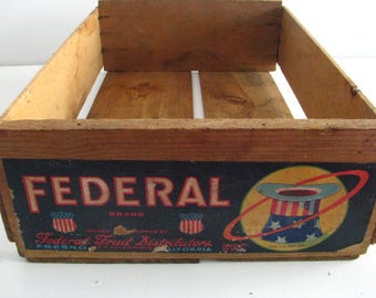
2) I would also get rid of the too-large basket on the table and replace it with a vintage fruit or produce lower-sided crate like one of these and add multiple smaller mis-matched tin planters in it. This will also help add color:
Or, you can get any kind of crate or tin bucket and add the vintage crate labels to it like these that can be ordered online at etsy or ebay or you can even order the templates and print them yourself and just distress them a bit:
3) Another idea is to find 3 or 4 larger old produce/fruit crates and stack them staggered in one of the corners where the print is. These can also be used to store things in. The crates can also be purchased on ebay or etsy and if you don't find ones with the perfect labels, or if you find some nice plain crates, you can again, order labels or print them yourself like the 2nd pic below.
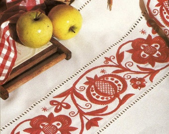
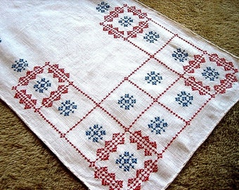
4) Another idea is to find a nice colorful vintage (or vintage designed) table runner, or you can very easily make one yourself, that has either blues or reds, both colors in it or just a plain blue or red table runner. I couldn't find exactly what I was looking for but here are some ideas:
Here, I took some pictures of the room from other angles. We haven't been in this house long and bought all new furniture for it, so some rooms (like this one) really are just getting decorated now.
Yep, definitely get rid of your centerpiece and set your table with some vintage red plates. I also would change out or just remove the two end chairs. Too formal. I don't even notice the chair rail for the sign. I like minimal-rustic.
I'm trying to figure out if I don't have to remove the chair rail although I did bring this up this to hubby and got a pretty definite no.
It's just a dining room. Do NOT remove the chair rail because of your choice in art. It's not like any snooty-hoo is going to be coming in and telling you about your "eyesore", and if they do, they are free to leave and not come back.
I think everything is fine except the colors in the room.
Leave the sign as is, leave the chair rail but get some expert advice on paint colors.
And yes, get rid of the sticks in the corner.
Please register to post and access all features of our very popular forum. It is free and quick. Over $68,000 in prizes has already been given out to active posters on our forum. Additional giveaways are planned.
Detailed information about all U.S. cities, counties, and zip codes on our site: City-data.com.

 Please register to participate in our discussions with 2 million other members - it's free and quick! Some forums can only be seen by registered members. After you create your account, you'll be able to customize options and access all our 15,000 new posts/day with fewer ads.