Please register to participate in our discussions with 2 million other members - it's free and quick! Some forums can only be seen by registered members. After you create your account, you'll be able to customize options and access all our 15,000 new posts/day with fewer ads.
That's a cool looking graphic and good information, but people do need to be aware of the cognitive dissonance when interpreting it.
The areas with lots of dots simply reflect population density, rather than "most educated", so you have to look very carefully at the colors to interpret how educated an area is, rather than how many dots clustered together. At first glance, if you're not careful, the most densely populated areas automatically look like the most educated because there are more dots.
Location: Chapel Hill, NC, formerly NoVA and Phila
9,779 posts, read 15,790,796 times
Reputation: 10888
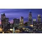
That map made my eyes hurt! Though, interesting to see where in the country the dense clusters of highly educated folks are. Boston, New York City, and DC really stood out to me. Locally, you could see that between Chapel Hill and Cary was highly educated along with Raleigh/North Raleigh, parts of Charlotte, Greensboro, and Winston Salem. Other cities were much more yellow (some college) like Burlington and Fayetteville.
People with advanced degrees are generally going to live and work where they capitalize on that education--cities and large metropolitan areas. I did a project in my first year LIS class that assessed educational attainment in Appalachia and down east the illiteracy rates were alarming. It was as many as 1 out of 4 or 5 people in some counties, pretty disheartening.
Please register to post and access all features of our very popular forum. It is free and quick. Over $68,000 in prizes has already been given out to active posters on our forum. Additional giveaways are planned.
Detailed information about all U.S. cities, counties, and zip codes on our site: City-data.com.

 Please register to participate in our discussions with 2 million other members - it's free and quick! Some forums can only be seen by registered members. After you create your account, you'll be able to customize options and access all our 15,000 new posts/day with fewer ads.


 Though, interesting to see where in the country the dense clusters of highly educated folks are. Boston, New York City, and DC really stood out to me. Locally, you could see that between Chapel Hill and Cary was highly educated along with Raleigh/North Raleigh, parts of Charlotte, Greensboro, and Winston Salem. Other cities were much more yellow (some college) like Burlington and Fayetteville.