Please register to participate in our discussions with 2 million other members - it's free and quick! Some forums can only be seen by registered members. After you create your account, you'll be able to customize options and access all our 15,000 new posts/day with fewer ads.
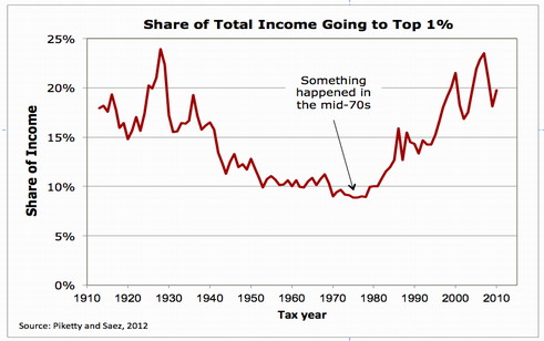
Mother Jones is a horribly biased, often misleading site. You should fact check most things they write, just like with Breitbart, and Cato. These particular graphs though? They're accurate. I'd be careful reading the story associated with them, but the graphs are accurate.
They very very clearly show the failed conservative policies, and do a good job demonstrating that our current presidents fairly conservative policies are not helping, we need serious change.
So asking Conservative to explain them is not a unreasonable request when the conservatives keep saying "just a few more tax cuts and you will all be rich....."
This is no strawman. I want these graphs justified.
The right-wing has a blind adoration of the ultra-rich. I'm asking for a reasonable explanation.
What difference is it if it's a blind adoration or one with your eyes wide open? We know what the last 6 years has produced. Record setting Wall Street profits, stagnant wages and hiring.
Please register to post and access all features of our very popular forum. It is free and quick. Over $68,000 in prizes has already been given out to active posters on our forum. Additional giveaways are planned.
Detailed information about all U.S. cities, counties, and zip codes on our site: City-data.com.

 Please register to participate in our discussions with 2 million other members - it's free and quick! Some forums can only be seen by registered members. After you create your account, you'll be able to customize options and access all our 15,000 new posts/day with fewer ads.


")
