Predictions: Global Warming and Public Opinion (activist, conspiracy, March, companies)
Please register to participate in our discussions with 2 million other members - it's free and quick! Some forums can only be seen by registered members. After you create your account, you'll be able to customize options and access all our 15,000 new posts/day with fewer ads.
Seems to me like there are more glaciers dissapearing and the changes in the polar ice cap are quite dramatic, I wouldn't base any opinion on a cold winter in a certain area.
Dramatic? Notice the sea ice comparisons. Go ahead and put in various dates and do comparisons. Dramatic is not what I would use to describe the long terms analysis.
Global warming is not a matter of opinion, public or otherwise. The earth has been in a warming trend for thousands of years; since the end of the ice age.
More than likely, a warming trend is preferable to a cooling trend.
It appears that purple is the highest density of sea ice followed by red, yellow, blue but very littel of any other color although the are covered by purple appears to be less in 2010
In some outlying areas yes, but the mass of the ice is denser. Also, if you read the current science of the issue, the melt is showing to be not from warming, but rather from wind patterns that have shifted and causes melt. This coincides with the largest melt areas being branches most vulnerable to this.
The main point is that there isn't a dramatic melt, in fact trends are currently showing growth that is closing back to that of earlier trends.
The pictures you sent from the UI were from the NASA site, indicated below is a good animation of the receding ice cap at the North Pole. It goes kind of quick but you can step through it by year from 1979 to 2005. They also have 2 mages of 1979 and 2005 ice concentrations at the bottom of the page and I would say that is a dramatic loss. I could not find anthing relating th eloss to wind currents rather than warming.
Still not sure why there is only one color on the UI website you sent but in their own words they indicate the dramatic loss of multi-year ice since 2007.
It doesn't discount warming, it is merely another fact that was not considered before when considering rate of melt and evidence to its cause.
As for dramatic, I will concede that if we are to narrow the window of assessment, there is a large loss in that time range, but I am interested why you think the return of extent is insignificant?
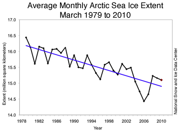
If we evaluate the decline of ice based on the same standards, then the loss is insignificant in its occurrence just as you mention the increase is. That is, if you look at the graph above, the return is almost back to its normal trend of roughly 2.6% per decade. Would not then the loss as you determine dramatic also make the return equally dramatic? Now obviously the point of contention made by those suggesting an ice free arctic is that this is simply a delay in the tipping point, but then this is a hopeful assessment that is attached to a bias.
The data is what it is. Yes, as you say a dramatic turn existed in a short period, yet as you also say, short time evaluation is not an appropriate measurement of the trend, though this is consistently the position by those in the field even though the long term trend is fairly consistent in its decline.
My point is that if we are to disregard the return, then we must also disregard the decline.
Depending on the source you use, their "commentary" on the data will vary. Some insert more assumptions of intent while others tend to provide more of a "here it is, you decide" type of analysis. Honestly, while I read what they provide in opinion, I take it with a grain of salt and pool from a larger source of opinions on what the data means (especially considering the revelations in the field that have administrations and some scientists purporting bias).
In the end, we have a down turn and an up turn in extent. Where it goes from there, time will tell. As for the cause, certainly there are numerous factors to consider. Warming is one, but there is also wind, and even volcanic influence as has been discovered in Greenland.
At the end of the day though, we have a 2.6% decline per decade to which a large decline indicated a pattern change in the 2006-2007, yet recovery placing it back into its trend 2008-2010. It is entirely possible that the extent could continue to grow taking us on trend or above it. There is also the possibility that the trend could increase in loss reaching the tipping point to which some seem to predict (though I honestly think this one very unlikely considering the data).
If I had to speculate, I think we may hit a track back to normal or above normal.
Also the graph you posted from the University of Colorado indicates an average ice loss of almost 400,000 sq miles over a 21 year period, you can't take 4 months or a year and draw the conclusion that there is a cooling trend. That is an enourmous amount of ice loss.
Nor can you with the extent of loss either to which 2006-2007 is greatly attributed to a "dramatic loss" spurring the opinion of an ice free zone.
As I said, the trend has been 2.6% loss per decade, that trend is consistent since 1979. There is no "dramatic" loss unless we assess only a small portion of the data to claim such.
Though, when you consider these points were brought up and still rejected without proper reasoning, it does seem to point to corruption.
Please register to post and access all features of our very popular forum. It is free and quick. Over $68,000 in prizes has already been given out to active posters on our forum. Additional giveaways are planned.
Detailed information about all U.S. cities, counties, and zip codes on our site: City-data.com.


 Please register to participate in our discussions with 2 million other members - it's free and quick! Some forums can only be seen by registered members. After you create your account, you'll be able to customize options and access all our 15,000 new posts/day with fewer ads.