Please register to participate in our discussions with 2 million other members - it's free and quick! Some forums can only be seen by registered members. After you create your account, you'll be able to customize options and access all our 15,000 new posts/day with fewer ads.
So we have some very large glass sliders in my family room where we installed some khaki colored curtains. I have gotten used to them but I have not lost sight of the fact that there is a lot of fabric there.
Anyway, my wife and I are in the process of buying a very expensive (and beautiful) sectional to go in the room. The last thing we need to decide is the fabric.
So while looking at samples, we had narrowed it down to a beige-ish 100% linen fabric that we think is absolutely stunning. But, we had not considered how it might look in front of the the drapes (which is where it would be).
Now we are sort of stumped. The two colors are a similar shade but very obviously different colors. We are now afraid that they may clash. Also, we already have a lot of very muted earth colors and wonder whether adding more of the same would sort of dampen the room?
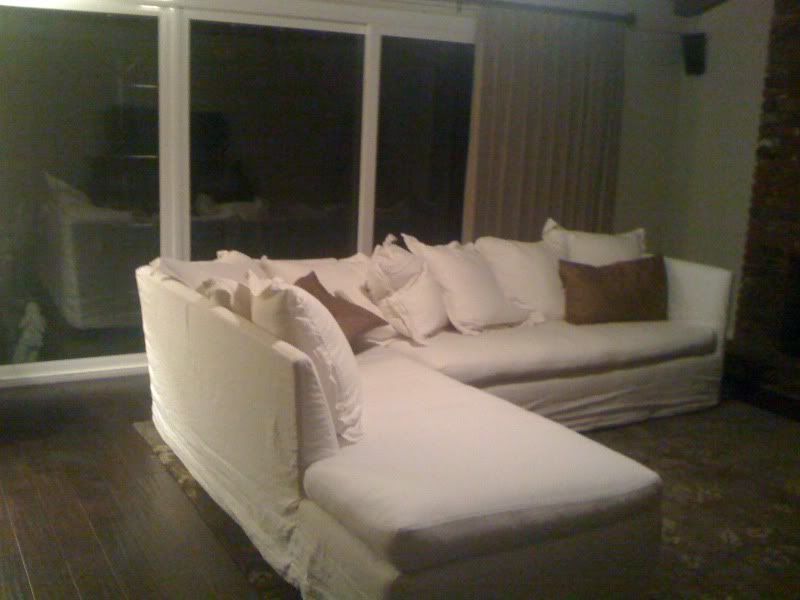
We actually got a loaner sofa from the company to try out (because we know the owner) and now I am considering whether we should go with a lighter, creamed colored fabric to brighten things up a bit. The is the actual color of the loaner (see below). I took this picture at night so the colors aren't perfectly accurate.
On the other hand, this will be in the family room so do we really want a lighter color that can be stained easily?!?!?
So in light of the curtains and the rest of the muted colors, would you go with a cream, a darker beige, or something else?
As you can see, we are very confused.
I'd go with the cream over the beige one - I think that would just be too much beige, boring and clashing since it most likely would have a different tone.
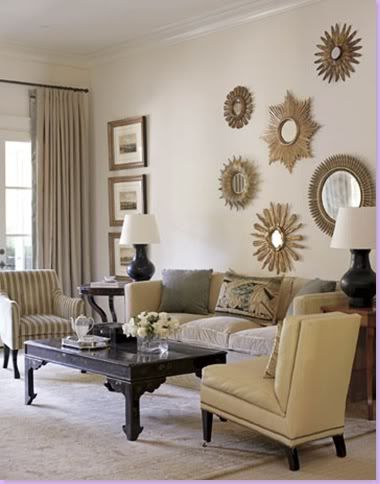
I love this example of a monochromatic living room - notice the subtleness of the added color - warm creams and beiges, dark wood, the metal on the frames and mirrors, the texture of that center couch pillow and couch fabric, the introduction of some dark gray in the pillows that plays off the darkness of the dark coffee table, chair legs and lamps - the striped chair that adds some visual interest.
The color of the couch, drapery and floor covering are basically the same but there is texture in each but it is the beautiful mix of earthtones, metal, texture, pattern and dark wood that makes this room rich and interesting.
There definitely is a rich layering of color and texture going on in this room - the black really ground the whole room.
Thought I'd give a quick update to see what people thought. As I mentioned, the sofa in the picture is a loaner. We had not considered keeping it because we were going to go with more fitted back cushions rather than the multi pillows you see. We figured that pillows would be everywhere and it wouldn't work well for us. But as it turns out, the pillows seem to be very functional and cozy. So we have decided to keep the multi pillow look.
This now opens up the possibility of actually keeping the loaner sectional. The sellers told us that they would sell us this sectional AND a new slipcover for the same price as a brand new sectional. So this would make sense no?
In this scenerio, we would end up with two slipcovers, which by the way are very expensive in and of themselves. With this information in hand, I am thinking that the new slipcover could be something more fun and colorful (since we already have a natural white sofa).
So far my wife doesn't see it this way, as she is still married to the linen beige fabric. But pretending for a second that she could be convinced, are there specific color families that people think will work?
The couch you posted looks a little lumpy, bumpy and disheveled - may need new cushions and new slipcovers.
If you bring in a couch that is a fun color, it would be a good thing to repeat that same color at least one other place in the room - a lampshade, a piece of artwork, a bit of the same color in the rug and/or throw pillow or simple a piece of glazed pottery on the coffee table in your sofa color.
Turquoise, apple green, pale gold, dark red, - all colors that would work well with earthtones.
But as you can see from the picture above that I posted, you don't need a lot of color to make a room beautiful or interesting.
You can always change out accessories that have color - it is more expensive to change out a couch color that you are tired of.
Thanks catt. And yes, buying a used sofa comes with some drawbacks as you noted. In person the sofa is not as dishoveled as it might appear but it is worth noting.
Also, one interesting feature about this particular sofa is that it is "green". The seat cushions have a 100% natural latex core. It makes for a different sort of feel when sitting but I don't mind it at all. I rather think it supports my back better. My wife on the other hand prefers one of their other seating options. We'll see how it goes.
In terms of color, we'll eventually figure this out. Thanks for posting the picture as it does give me a good idea of how my wife's current vision might look.
So we have some very large glass sliders in my family room where we installed some khaki colored curtains. I have gotten used to them but I have not lost sight of the fact that there is a lot of fabric there.
Anyway, my wife and I are in the process of buying a very expensive (and beautiful) sectional to go in the room. The last thing we need to decide is the fabric.
So while looking at samples, we had narrowed it down to a beige-ish 100% linen fabric that we think is absolutely stunning. But, we had not considered how it might look in front of the the drapes (which is where it would be).
Now we are sort of stumped. The two colors are a similar shade but very obviously different colors. We are now afraid that they may clash. Also, we already have a lot of very muted earth colors and wonder whether adding more of the same would sort of dampen the room?
We actually got a loaner sofa from the company to try out (because we know the owner) and now I am considering whether we should go with a lighter, creamed colored fabric to brighten things up a bit. The is the actual color of the loaner (see below). I took this picture at night so the colors aren't perfectly accurate.
On the other hand, this will be in the family room so do we really want a lighter color that can be stained easily?!?!?
So in light of the curtains and the rest of the muted colors, would you go with a cream, a darker beige, or something else?
As you can see, we are very confused.
I would go with something completely different. All of the colors you mentioned along with what is in the room would make it very bland, in my opinion.
I think you could use a pop of color to offset all the monotone. You might be surprised how well it works.
If you have a bunch of beige and cream and browns, try something completely different, color wise. (I vote for a dark red.)
Please register to post and access all features of our very popular forum. It is free and quick. Over $68,000 in prizes has already been given out to active posters on our forum. Additional giveaways are planned.
Detailed information about all U.S. cities, counties, and zip codes on our site: City-data.com.

 Please register to participate in our discussions with 2 million other members - it's free and quick! Some forums can only be seen by registered members. After you create your account, you'll be able to customize options and access all our 15,000 new posts/day with fewer ads.