Please register to participate in our discussions with 2 million other members - it's free and quick! Some forums can only be seen by registered members. After you create your account, you'll be able to customize options and access all our 15,000 new posts/day with fewer ads.
Those cities with the bigger images are that way because they are big.
Is Phoenix a third the size of SA? No. It is larger than SA, yet on your maps it is a third the size of SA. Clearly what you are saying is not accurately being reflected by your maps.
Location: The Greatest city on Earth: City of Atlanta Proper
8,486 posts, read 15,008,050 times
Reputation: 7334
Quote:
Originally Posted by gwillyfromphilly
I don't think there is a conspiracy either but when applying logical sense to the conversation, it is clearly evident that some of the images are not scaled properly. Going by the maps it looks like San Antonio has twice the land mass of Phoenix and it also looks like Philly's city limits are almost a big as Dallas. The problem isn't so much Google but more of you making mistakes in properly scaling the maps. An important thing to know when comparing maps is that you have to pay close attention to detail because if you don't the careless mistakes will show up when the product is
finished.
Well, despite the perception, Dallas isn't that much larger than Philly at a little over twice the size. But, however, there is an explanation for all of this.
Quote:
Originally Posted by BevoLJ
Is Phoenix a third the size of SA? No. It is larger than SA, yet on your maps it is a third the size of SA. Clearly what you are saying is not accurately being reflected by your maps.
What is so hard about understanding how square milage is calculated? It's literally as simple as width x height. Two cities can look wildly different from each other on a map depending how they are laid out, even though they have the "same" square mileage. For example, a city that is 5 miles east to west and 10 miles north to south will have the "same" square mileage of a city that is 2 miles east to west and 25 miles north to south. Despite having the "same" square mileage, on a map these to hypothetical cities will look vastly different.
Again though, as I mention earlier, feel free to make your own maps.
Last edited by waronxmas; 07-19-2012 at 10:54 PM..
What is so hard about understanding how square milage is calculated? It's literally as simple as width x height. Two cities can look wildly different from each other on a map depending how they are laid out, even though they have the "same" square mileage. For example, a city that is 5 miles east to west and 10 miles north to south will have the "same" square mileage of a city that is 2 miles east to west and 25 miles north to south. Despite having the "same" square mileage, on a map these to hypothetical cities will look vastly different.
Again though, as I mention earlier, feel free to make your own maps.
You aren't getting it. It has nothing to do with the shapes. The scales you are using are totally different. Just because the numbers both say "10" does not mean they are to the same scale. You see the little lines below the "10"? That is the scale and it must be the same in both maps for it to be accurate. Yours are NOT the same size. Take a piece of paper and put it up to the screen. On the map of San Antonio mark the vertical lines on the top of the scale below the 10. Now take that same piece of paper and put your left mark on the left vertical line on your map of Phoenix. Then make a mark by the right vertical marker on the Phoenix map. Do you notice how the right mark you made for Phoenix is not in the same spot as your right mark from your map of San Antonio? That is because the two maps are not to scale. They are not accurate. None of your maps are.
The number of miles you used for your scale (10 miles) is completely irrelevant if you are using different size scales for what 10 miles equals on each map for each city. The scale is what is important, not the number of miles each scale represents.
I will do an accurate representation of the two cities in discussion. You can use the paper test to check my accuracy.
On the two maps below, I am just linking your map of SA. In the map of Phoenix it is your map, only I increased the scale of the image so that the two scales in each image are equal. In both images 121 pixels represent 10 miles.
Now compare that to the two images you posted: In San Antonio you have 121 pixels representing 10 miles with in Phoenix you have 61 pixels representing 10 miles.
Do you see the difference? Can you see how in the images I posted the scale are the same? Meaning that the same number of pixels in each image represent the same distance? Please remember, on a computer theses may just look like drawings. But they are real cities, with real people and real buildings in them. Millions of people in each of these cities you are representing. It should be important to you to try to represent them accurately. I am only trying to help you do that.
Annexation played a bigger role in the growth of the cities in the south and west than migration? That is not true. I assure you there were not 1.8 million people anywhere near Austin or all the counties around Austin combined in 1950 to account for the current population today through annexation. Someone suggested looking at counties since those lines haven't chaged one bit. Travis Co (which Austin is in) has grown from in 1950 @ 160,000 to over a million people today. The county size hasn't changed at all. So how do you account for that change when the size hasn't changed and your annexation suggestion is taken off the table?
I didn't say that definitely in every city annexation was responsible for more growth than migration. I said 'if not more' I believe. That was simply in case there were some cities where it played a bigger part. I have no idea if there are. You're right however, as others; counties are a better measure of growth, though sometimes they do change in size a little.
People forget that cities in the South and West can be huge and if they were smaller they'd have much smaller populations. If you live in or love the South then of course you'll revel in the fact that your region has grown massively in the last 50 years. You need to remember however, that you either have to use MSA or urban area data when looking at cities, or just keep in your mind that Houston's twice the size of New York in area because despite the South now having the highest population (I think), it's a much larger region that the Northeast and your cities if compared like for like are just not as large in most cases.
Quote:
Originally Posted by BevoLJ
You aren't getting it. It has nothing to do with the shapes. The scales you are using are totally different. Just because the numbers both say "10" does not mean they are to the same scale. You see the little lines below the "10"? That is the scale and it must be the same in both maps for it to be accurate. Yours are NOT the same size. Take a piece of paper and put it up to the screen. On the map of San Antonio mark the vertical lines on the top of the scale below the 10. Now take that same piece of paper and put your left mark on the left vertical line on your map of Phoenix. Then make a mark by the right vertical marker on the Phoenix map. Do you notice how the right mark you made for Phoenix is not in the same spot as your right mark from your map of San Antonio? That is because the two maps are not to scale. They are not accurate. None of your maps are.
The number of miles you used for your scale (10 miles) is completely irrelevant if you are using different size scales for what 10 miles equals on each map for each city. The scale is what is important, not the number of miles each scale represents.
I will do an accurate representation of the two cities in discussion. You can use the paper test to check my accuracy.
On the two maps below, I am just linking your map of SA. In the map of Phoenix it is your map, only I increased the scale of the image so that the two scales in each image are equal. In both images 121 pixels represent 10 miles.
Now compare that to the two images you posted: In San Antonio you have 121 pixels representing 10 miles with in Phoenix you have 61 pixels representing 10 miles.
Do you see the difference? Can you see how in the images I posted the scale are the same? Meaning that the same number of pixels in each image represent the same distance? Please remember, on a computer theses may just look like drawings. But they are real cities, with real people and real buildings in them. Millions of people in each of these cities you are representing. It should be important to you to try to represent them accurately. I am only trying to help you do that.
You're totally right on that man. We (including you I'm sure) very much appreciate the guy's effort in giving us those maps, but that effort is not in any way something to hide behind when his scales are totally off in some cases. I'm with you totally in what you're saying about Phoenix vs San Antonio.
It's very annoying because when you try and get some of these maps together, none of the scales are the same. You have to resize the images because Google does use different for it seems every city, it's very strange. I'll try and post some mas myself. - Scratch that, I don't have the time or the will to do that now.
If you are interested there is a thread on SSP that is AMAZING! It is a guy who made maps of these, but not just for city limits. He went and did it for the developed areas for different cities and regions. And they are all to proper scale. The sheir amount of work he put into it is huge and the results really showed.
While you did already state that, you were wrong. They are not the same scale.
Just because the scale says 10, if you increase the image size to over twice as large as the rest of the pictures they are not still the same size. I can take a screen shot of Dallas with the scale set to 10 miles, then shrink the image to an 1x1 inch picture, and take a screen shot of Chicago and blow up the image to the size of a football field. That wouldn't mean since both originals was set to 10 miles for scale it is still the same or that they are accurate comparisons images.
Quote:
Originally Posted by gwillyfromphilly
I don't think there is a conspiracy either but when applying logical sense to the conversation, it is clearly evident that some of the images are not scaled properly. Going by the maps it looks like San Antonio has twice the land mass of Phoenix and it also looks like Philly's city limits are almost a big as Dallas. The problem isn't so much Google but more of you making mistakes in properly scaling the maps. An important thing to know when comparing maps is that you have to pay close attention to detail because if you don't the careless mistakes will show up when the product is finished.
Thank you!!!!!!!! Scale markers mean nothing unless the images are comparable. The images that he posted are not superimposable so you have to imagine what some would look like smaller to try to compare them with others.
Saintmarks is acting like I can't read a map, but he is the one who can't see the maps can't be compared as is
Quote:
Originally Posted by BruceTenmile
You're totally right on that man. We (including you I'm sure) very much appreciate the guy's effort in giving us those maps, but that effort is not in any way something to hide behind when his scales are totally off in some cases. I'm with you totally in what you're saying about Phoenix vs San Antonio.
It's very annoying because when you try and get some of these maps together, none of the scales are the same. You have to resize the images because Google does use different for it seems every city, it's very strange. I'll try and post some mas myself. - Scratch that, I don't have the time or the will to do that now.
I am with you too. I appreciated the effort he put into it. I was just suggesting that everything should have been kept at the same scale. I have used that program before and I noticed that for some cities it flips scale.
That was all I was pointing out and some were acting like I was attacking War. Me and him have been friends on here for as long as I have been on this sight, don't know why I would have to hold back on my observations just because he spent lots of time on it.
Last edited by HtownLove; 07-20-2012 at 09:44 AM..
Location: The Greatest city on Earth: City of Atlanta Proper
8,486 posts, read 15,008,050 times
Reputation: 7334
Quote:
Originally Posted by BevoLJ
You aren't getting it. It has nothing to do with the shapes. The scales you are using are totally different. .
, again.
No, I get what you are saying exactly and you are wrong. You are stuck on how many pixels these images are and that's the irrelevant point. We're talking about square mileage and shapes have everything to do with why the maps look the way they are.
Increasing the images to the same pixel size will not show the same information (though I suspect it makes some feel better).
Here's what I mean.
In your post you took one of images and increased it to the size of another one. Contrary to what you state, this give a false perspective of the area involved. Let's first put both pictures side by side as you did:
Now, let's actually measure the distances involved using the handy ruler tool in Google Maps.
First, San Antonio:
As you can see San Antonio's city limits covers (at an extremely rough estimate) approximately 34 miles north to south, and 23 miles east to west.
Next, Phoenix:
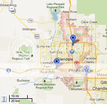
As you can see Phoenix's city limits covers (at an extremely rough estimate) approximately 41 miles north to south, and 13 miles east to west at it's widest point (some areas of the city are 5 and 8 miles across and smaller).
So why different sizes of the images? In order to display the distances involved at a specific "height" in Google Maps, different zooming is applied to accommodate as much as possible on the screen. While it appears to create an unreleased view of an area, it's actually the most accurate way.
While I had to add the lengths involved to show you how far of an area this covered, one who lives in that area would immediately know the distances involved. This was the point of the original exercise: To show the relation of the city limits to the surrounding metro area in each of these cities. The size of the images is irrelevant because it doesn't create an accurate relation of area.
To make you feel better though, I zoomed the map for Phoenix at a closer level ("5 miles") so that the size of the San Antonio and Phoenix maps would roughly "match".
Again, the only way to get all cities to show the correct relation to each and the surrounding metro area was to "zoom out" at a non-ridiculous height so that all cities could more or less be seen in how their environs are situated in their respective metros. Too close and the larger cities in land area wouldn't be shown fully. Too far away and the smaller sized cities would look like dots. This was the happiest median I could find.
Location: The Greatest city on Earth: City of Atlanta Proper
8,486 posts, read 15,008,050 times
Reputation: 7334
Quote:
Originally Posted by HtownLove
That was all I was pointing out and some were acting like I was attacking War. Me and him have been friends on here for as long as I have been on this sight, don't know why I would have to hold back on my observations just because he spent lots of time on it.
To set the record straight, I didn't take it as you were blindly attacking me. It was because of the way you were approaching the subject. I know you know I'm not afraid to say if I thought it were wrong.
To set the record straight, I didn't take it as you were blindly attacking me. It was because of the way you were approaching the subject. I know you know I'm not afraid to say if I thought it were wrong.
was not specifically talking about you, was talking to those rushing to your rescue.
Quote:
Originally Posted by waronxmas
, again.
No, I get what you are saying exactly and you are wrong. You are stuck on how many pixels these images are and that's the irrelevant point.
He is not wrong. And he is not talking about pixels he is talking about standardizing the scales.
Quote:
Now, let's actually measure the distances involved using the handy ruler tool in Google Maps.
This is exactly what makes things unequal. The ruler on one pic is meaningful to that pic only and thus a map that looks big means nothing because it can only be compared to itself. Its like taking a picture of a ruler and trying to measure something on another picture using the ruler on the 1st pic. If the scales are not equal the ruler is useless.
Yours maps were nice hun, but posters can't use it to say "man, look how small Phoenix looks compared to Philly. "
No, I get what you are saying exactly and you are wrong. You are stuck on how many pixels these images are and that's the irrelevant point. We're talking about square mileage and shapes have everything to do with why the maps look the way they are.
Increasing the images to the same pixel size will not show the same information (though I suspect it makes some feel better).
When I was saying pixels I wasn't talking about the pixels for the image. I was talking about how many pixels it was from the two vertical lines on the scale.
Let us see if we can agree on one thing. Should the scales mater or not? Are the scales used to measure distance in two maps at all relevant to if those maps are accurately being compared or not?
Lets make it so we can no longer see the city, because I think that is what is confusing things.
Here are the scales from my two images:
SA:
Phoenix:
Here are the scales from your two images:
SA:
Phoenix:
Now in the above images please look at these two lines:
The number of pixels between the vertical line on the left of the "10 mi" and the verticle line to the right of the "10 mi" represent the scale of the map. For two maps to be comparable the same distance between those two lines must represent the same distance in real life. In the real world. If one map is representing 10 miles as a very tiny distance on a map, then the map will look small. But if 10 miles is being represented by a large distance on that map, the map will look large. This is what you are doing. You are making 10 miles be represented by a small distance on some map, and 10 miles is being represented by large distances on other maps. Which mean they are not at all comparable to one another.
If you can get the scales of each map so that the same distance on the map (on computers that will be in pixels) is representing the same distance in the real world, then your maps will be comparable. If you look at the maps I did of SA and Phoenix, the scales are the same.
How many pixels the overall images is, is irrelevant. It is the number of pixels between the two top verticle lines of the SCALE, not the image size, that is important. The shape of the city is irrelevant. The scale being used to measure the distance must match to make an accurate comparison.
Edit: Here please look at these and tell me if you can see the difference in how the scales relate to one another?
Correct:
Incorrect:
Last edited by BevoLJ; 07-20-2012 at 02:16 PM..
Please register to post and access all features of our very popular forum. It is free and quick. Over $68,000 in prizes has already been given out to active posters on our forum. Additional giveaways are planned.
Detailed information about all U.S. cities, counties, and zip codes on our site: City-data.com.

 Please register to participate in our discussions with 2 million other members - it's free and quick! Some forums can only be seen by registered members. After you create your account, you'll be able to customize options and access all our 15,000 new posts/day with fewer ads.


")


