Welcome to City-Data.com Forum!
U.S. CitiesCity-Data Forum Index
Go Back   City-Data Forum > General Forums > Weather
 [Register]
Please register to participate in our discussions with 2 million other members - it's free and quick! Some forums can only be seen by registered members. After you create your account, you'll be able to customize options and access all our 15,000 new posts/day with fewer ads.
View detailed profile (Advanced) or search
site with Google Custom Search

Search Forums  (Advanced)
Reply Start New Thread
 
Old 06-15-2013, 02:31 PM
nei nei started this thread nei won $500 in our forum's Most Engaging Poster Contest - Thirteenth Edition (Jan-Feb 2015). 

Over $104,000 in prizes has already been given out to active posters on our forum and additional contests are planned
 
Location: Western Massachusetts
45,983 posts, read 53,454,351 times
Reputation: 15184

Advertisements

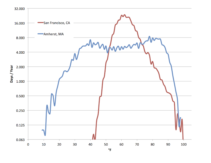
I made a long post with graphs of daily maximum distributions on the Death Valley thread; I thought perhaps they deserved their own thread. First, using 1961-2012 station data for Amherst, MA and San Francisco, CA. The San Francisco data is from the Mission District, which is relatively warm for the city, further away from the Pacific and the worst of the fog blocked by low hills. The graph below shows the number of days/year with a particular temperature in °F. I chose °F because the US Weather Service records temperature to the nearest °F.


Interesting observations:

1) San Francisco has a single peak around the low 60s, with a steep decline with colder or warmer temperatures.
2) In San Francisco, for temperatures far away from the mean, the hot temperatures have a much longer tail while colder maxes become rare very quickly for colder °F. Probably because there's a distant but rare source of hot weather (inland) but no real path for very cold weather to arrive, the sea buffers cold temperatures more. The interior is not that much colder than city in the winter, but much hotter in the summer.
3) Amherst has two peaks: a summer peak around 80°F, and a winter peak around 40°F (colder than any day in the San Francisco record!).
4) Opposite of San Francisco, the cold extremes of Amherst have a longer tail while the hot extremes become very rare with a smaller increase in temperatures. For that reason, the summer peak is taller on the graph with more days: days tend to cluster more at the peak while the winter distribution in temperature is broader. In the warmer months, a dry sunny day (and many non-sunny ones mid-summer) will hover rather close to 80°F. In winter, the temperature of a clear day is unpredictable.
5) Amherst has a trough for mild maxes (50s and 60s). If you love those temperatures, you'll get frustrated, as many days tend to be warmer or colder. You can be consoled that they're at least more common than 20s or 90s. This makes sense because there's fewer months that average around that temperature.

I can make more of these graphs rather quickly for many US stations (and maybe some non-US stations).

To see the shape of the extremes, a log scale is helpful. Here's the same on a log scale.


For both cities, you can see the slope of the line stays mostly the same at more extreme temperatures. Amherst seems to deviate from a line more, perhaps a quadratic would be a better fit (a line on a log scale is an exponential decay; a quadratic polynomial, a Gaussian). The data is sparse enough at the extremes it's difficult to judge the best fit. For the coldest temperatures, the distribution of temperatures of Amherst definitely does not follow a quadratic fit. In the record there, is one temperature at -3°F, four at 6°F, one at 8°F, and five each at 9°F and 10°F, it doesn't follow any clear decay pattern.

For the hottest temperatures, the decrease in frequency of hotter temperatures fits a curve better. Here are two cumulative graphs I made. They graph the number of days above a specific temperature:


And on a log scale to better compare the rarer temperatures:


San Francisco has a fairly steady slope, while for Amherst, warm temperatures are rather common and then with slightly more heat, their frequency drops rapidly off. Unlike at the cold end, you don't get random extreme outliers not following the smooth curve. Now, I also looked at numbers for Death Valley, CA. Because Death Valley is so much hotter, I can't fit on the same temperature axis. Instead is set all of them relative to the hottest recorded temperature. On this scale, -1°F is one degree cooler than the hottest ever recorded so 98°F for Amherst, 102°F for San Francisco, 128°F Death Valley. -5°F on this scale would be 5°F cooler than the record.


What I find really neat here, is that even though Amherst and Death Valley have completely different weather, the distribution of extremely hot temperatures (relative to the record) is similar. Now I find a frequency (non-cumulative) graph of the hottest temperatures recorded at Death Valley.


Log scale again, to see the extreme events better. I fit a quadratic to the graph, shown as a dashed line. Extrapolating it predicts the frequency of increasingly hot temperatures, but it's hard to gauge it's accuracy, as it's just statistic fitting onto sparse data with no science behind it. I added some comments on the prediction at the end of this post, which has some of the same graphs.

Last edited by nei; 09-16-2014 at 02:13 PM..
Reply With Quote Quick reply to this message

 
Old 06-16-2013, 11:20 AM
 
Location: HERE
2,043 posts, read 3,885,982 times
Reputation: 597
Very interesting. It's very common for SF to have highs of around 60 in summer so I'm not surprised.

Meanwhile, 60 as a high here in San Jose in summer is VERY RARE even though we are only an hour's drive away; in fact I can't even remember a summer day here with a high less than 70.

San Jose's summer highs are usually in the low 80s but can range anywhere from 70-105 in a typical summer. Our winter highs average in the upper 50s but can range anywhere from 42-75 in typical winter. We definitely have a larger standard deviation than San Francisco but of course, we are nowhere near the variation you have in the Eastern U.S.

I would like to see a graph comparing San Jose to San Francisco and Sacramento.
Reply With Quote Quick reply to this message
 
Old 06-16-2013, 10:25 PM
B87
 
Location: Surrey/London
11,769 posts, read 10,591,349 times
Reputation: 3099
I created a days above specific temp graph for London but can't upload it.

I used a few data points and then used a line of best fit.

0c = 364 days
10c = 290 days
18c = 125 days
21c = 82 days
25c = 28 days
27c = 14 days
29c = 8 days
30c = 4 days
32c = 1 day

It looks fairly accurate, there are about 190 days above 15c (the avg annual max is 15.2).
Reply With Quote Quick reply to this message
 
Old 07-01-2013, 06:22 PM
nei nei started this thread nei won $500 in our forum's Most Engaging Poster Contest - Thirteenth Edition (Jan-Feb 2015). 

Over $104,000 in prizes has already been given out to active posters on our forum and additional contests are planned
 
Location: Western Massachusetts
45,983 posts, read 53,454,351 times
Reputation: 15184
I made similar graphs for daily mins. Amherst, MA and San Francisco (note for the first graph the two locations have different axes):


The peak around 30°F for Amherst is interesting. Colder than that is a long (exponential?) tail. Warmer rather flat till in the mid 60s. And on a log scale:

Reply With Quote Quick reply to this message
 
Old 07-01-2013, 06:25 PM
nei nei started this thread nei won $500 in our forum's Most Engaging Poster Contest - Thirteenth Edition (Jan-Feb 2015). 

Over $104,000 in prizes has already been given out to active posters on our forum and additional contests are planned
 
Location: Western Massachusetts
45,983 posts, read 53,454,351 times
Reputation: 15184
Quote:
Originally Posted by AdriannaSmiling View Post
Very interesting. It's very common for SF to have highs of around 60 in summer so I'm not surprised.

Meanwhile, 60 as a high here in San Jose in summer is VERY RARE even though we are only an hour's drive away; in fact I can't even remember a summer day here with a high less than 70.

San Jose's summer highs are usually in the low 80s but can range anywhere from 70-105 in a typical summer. Our winter highs average in the upper 50s but can range anywhere from 42-75 in typical winter. We definitely have a larger standard deviation than San Francisco but of course, we are nowhere near the variation you have in the Eastern U.S.

I would like to see a graph comparing San Jose to San Francisco and Sacramento.
I picked San Francisco because while it has much colder average summer highs than my town, its record is about the same. So the shape of the curve for San Francisco must look very different for hot temperature, with well hot temperatures above the summer average max relatively common, while for here it's unusual to get more than 10°F above in the summer.

I'll do San Jose and Sacramento sometime this week.
Reply With Quote Quick reply to this message
 
Old 07-02-2013, 09:21 AM
 
Location: Germany
504 posts, read 778,440 times
Reputation: 168
This is a great idea and very interesting cause it reflects the climate of the cities more accurately than only Avg. max. and avg. min temperatures. I'm going to do this for a german location .
Reply With Quote Quick reply to this message
 
Old 07-02-2013, 10:53 AM
 
Location: Germany
504 posts, read 778,440 times
Reputation: 168
So here it is.

I created a graph for the german city "Würzburg". It's pretty much in the centre of Germany at an elevation of ~200m.
I used data for the Min- and the max-temperatures. Notice that 5 (°C) in fact means the range from 5.1°C to 4.1°C so it actually should say 4,6 instead of 5 (sorry for the mistake). So -10 actually is -9.9 to -10.9 .... so the whole graph looks a bit warmer than it is.

X-axis is of course temperature in °C and y-axis are days/year.

Reply With Quote Quick reply to this message
 
Old 07-02-2013, 06:25 PM
 
Location: Paris
8,159 posts, read 8,728,455 times
Reputation: 3547
For Paris-Orly, in Celsius


Log scale, same Y-axis


As in Würzburg, the yearly amplitude for lows is lower than for highs, so the latter are more spread out. For the same reason, the "max" curve looks like a camel's back whereas the "min" one has only one peak. Lows have a rather long tail towards the cold end but almost none towards the warm end. The "max" curve is more symmetric, as we regularly get much above normal highs in summer.
Reply With Quote Quick reply to this message
 
Old 07-02-2013, 07:05 PM
 
Location: In transition
10,635 posts, read 16,694,364 times
Reputation: 5248
It would be interesting to see Vancouver compared with Toronto in the winter months
Reply With Quote Quick reply to this message
 
Old 07-03-2013, 02:10 PM
 
Location: Germany
504 posts, read 778,440 times
Reputation: 168
hey. I made a new graph to compare the avg. max. days of Würzburg with some northern swedish locations. The places I used are situated in the northernmost part of Sweden and one (Naimakka) is the coldest inhabited place in Sweden judging by annual mean temperature. I also corrected the data of Würzburg cause I made a little mistake in the first graph... Additionally, I changed the scale a bit so that -33 no longer means -32.9 to -33.0, but < -32.4 to > -33.5 so that it's more accurate.
here it is:

x-axis temperature in C, y-axis days/year, graphs show the daily max. temperature. (the last point of a graph is always the first 0, after which only other 0 follow)


Naimakka-data: 1965-1995
Würzburg-data: 1980-2012
Karesuando-data: 1961-2011

Last edited by tärnajokk; 07-03-2013 at 02:24 PM..
Reply With Quote Quick reply to this message
Please register to post and access all features of our very popular forum. It is free and quick. Over $68,000 in prizes has already been given out to active posters on our forum. Additional giveaways are planned.

Detailed information about all U.S. cities, counties, and zip codes on our site: City-data.com.


Reply
Please update this thread with any new information or opinions. This open thread is still read by thousands of people, so we encourage all additional points of view.

Quick Reply
Message:


Over $104,000 in prizes was already given out to active posters on our forum and additional giveaways are planned!

Go Back   City-Data Forum > General Forums > Weather

All times are GMT -6.

© 2005-2024, Advameg, Inc. · Please obey Forum Rules · Terms of Use and Privacy Policy · Bug Bounty

City-Data.com - Contact Us - Archive 1, 2, 3, 4, 5, 6, 7, 8, 9, 10, 11, 12, 13, 14, 15, 16, 17, 18, 19, 20, 21, 22, 23, 24, 25, 26, 27, 28, 29, 30, 31, 32, 33, 34, 35, 36, 37 - Top