Please register to participate in our discussions with 2 million other members - it's free and quick! Some forums can only be seen by registered members. After you create your account, you'll be able to customize options and access all our 15,000 new posts/day with fewer ads.
Here are the designs submitted for the new Providence pedestrian bridge.
PVD planning's photosets on Flickr (http://www.flickr.com/photos/55268422@N08/sets/ - broken link)
I think Design team 4 has a beautiful design but when I read it would be mostly wood- don't think that's a good idea! I agree with the comments from people who like shaded places to sit- think that's important since summer is when people would be hanging out on a bridge...
Which do you like??
The designs fall into two categories. Form or Function. It seems that some designs want to be more public art and a stand alone destination (1,2,4,6 and 7 fall into this category) while others seem to emphasize function more (3,5,8,9 and 11 fit in here) than art. Neither side (functional or art/destination) completely excludes the other (after all, the artistic ones are still bridges and the functional ones maintain some unique design aspects); but generally they lean further to one side than another.
That said, I like 10 the best. I think it's both functional and a destination in its own right. To me, it serves both purposes best. It's a good reflection of it's cousin down at the basin in Water Place Park. The part that makes me nervous is the cafe. Yes, it's a great concept but what if it doesn't take off? I know they'll have foot traffic, but it seems like a bit of a novelty. It would be shame to have an abandoned space on the bridge (and would be a target for vandalism). I saw somewhere else that someone suggested a canoe/kayak rental instead of a cafe which is a perfect utilization of that space.
Again, I think 10 is the best of the bunch. I think 8, 5 and 3 are elegant and very much functional. I like that 5 has a separate bike area and walking area (it appears that others tried to incorporate this too, but not as effectively). It's a pain for bikers to have to dodge pedestrians, so separation will eliminate some problems. 10 doesn't separate but it looks pretty roomy.
My least favorites are 1,2 and 7. 1 is interesting looking, but the planters are oddly placed. I think that while they look alright in the rendering (there's not such thing as a bad rendering), they'll translate to wasted space in real life. They're pointless.
2 is my least favorite by far. I'll start with the fact that I think the "The Creative Capital!" sign is a tacky touch (really, an exclamation point?) but it goes FAR beyond that. Many of those paths are dead-ends leading nowhere. They're narrow (meaning biker v. pedestrian issues elevated), and indirect (you'll want to cross as quickly as possible when walking across a windswept river in December and twisting paths won't be fun). To add to that, they have a useless, bland plaza in the middle. It looks interesting in the rendering, but number 2 is incredibly impractical.
7 just looks off. It has two areas that lead to nowhere. and doesn't stand out as being that interesting. It's neither as functional as the most functional bridges or as attractive and unique as the more artistic ones. It's "meh."
As I said before, I like 10 the best. I think 8 or 5 (even 3) would be great too.
The rendering for number 4 made me laugh a little. Why is it autumn on the bridge on number 4 (orange leaves) and summer on the river banks (green leaves)? Will number 4 somehow combat global warming? Is it its own microclimate? I don't know how they plan to squeeze four giant trees onto a bridge like that, but I'd be interested to see how they try. The design is really cool though. I just don't think it would translate well (there doesn't appear to be much room for bikes) in real life.
I looked at 10 again and I must say it looks a little 1960s to me- the nadir of architecture in my mind. I don't like the extreme plain lines, the uncomfortable looking seating (concrete benches with no backs?), lack of shade, etc. However, the cafe idea is interesting and the shape is practical.
Maybe some melding of several of the proposed designs???
On another note, why do the architects keep specifying materials that can't be easily cleaned of graffiti- seems everything that gets built around here is attacked!
I agree with Irfox, Design number 10 seems to be mesh with the rest of the city the best . It may not be the one that stands out the most but I think the classic design will with stand the test of time.
Also, I like the idea of a cafe there, but the kayak/ canoe idea is great as well. It would be nice to go there and take advantage of the water.
I looked at 10 again and I must say it looks a little 1960s to me- the nadir of architecture in my mind. I don't like the extreme plain lines, the uncomfortable looking seating (concrete benches with no backs?), lack of shade, etc. However, the cafe idea is interesting and the shape is practical.
Maybe some melding of several of the proposed designs???
On another note, why do the architects keep specifying materials that can't be easily cleaned of graffiti- seems everything that gets built around here is attacked!
I can see where you're coming from. When I think of 1960's architecture, I think of the materials and planning that went into it, not so much the lines (which can be beautiful). The 60s was the era of Brutalism and Concrete (see: UMass Dartmouth, Boston City Hall, State Services Center, etc). I'm not a fan of the cold, unfriendly nature of the that type of architecture (though it makes for a good photo) either.
I like the lines on number 10. They remind me more of early functional modernism (see Bauhaus Dessau) which combined practicality with sleek, modern design (a big departure from the popular styles of the time). When I look at description of 10, I see that the design carefully considers the flow of traffic and where it will be going. It doesn't just look functional, it really is. This diagram (http://www.flickr.com/photos/55268422@N08/5142927247/in/set-72157625305178804/ - broken link) illustrates it the best. The materials are also a far cry from cold 1960s styles. I like the wood and glass on number 10 but your concern about vandalism is one of my biggest fears too.
I think a mix of some of the designs would be nice too. If Number 4 could make itself a little more bike friendly, it would probably be my favorite as well. I'm not thrilled with any of the tall spires or cable towers on some of the bridges as I think they detract from the skyline (and one of the best angles is from where the bridge will be).
I fear vandalism too. This type of structure is so susceptible by nature, anyway. Number 10 scares me most because if that cafe space remains empty for any period of time, it may as well have a big bullseye on it. Even while operational it stands a risk. It is literally under a bridge. Hopefully this is addressed before a winner is chosen.
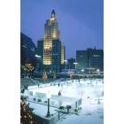
They did use a lot of wood! The design echoes the prow of a boat, which is nice, but I do wonder about its longevity as a structure. At least the steel looks durable.
That odd patch of grass in the original design is gone? No loss there.
It has an appropriate nautical feel. The stainless steel contrasts nicely with the warm wood decking. I like it. But apparently, with the original costs estimates greatly escalated, it would have suffered a much cheaper typical concrete bridge design, if construction had started today. Expect the need for ongoing maintenance. The good news is periodic wood decking replacement, as will be needed, looks to be easy.
I like it in reality as well. Wonder what the appropriation is for riverwalk maintenance she said naively. They used Brazilian hardwood which could be Ipe or Cherry? Both great and long wearing but very expensive to replace in planks.
Hopefully, they start by placing trash barrels at both ends of the bridge. What about security cameras to monitor for graffiti and other vandalism?
Imagine if Fane had a cost overrun of 7+ times his original estimate? Ha Ha Ha
Please register to post and access all features of our very popular forum. It is free and quick. Over $68,000 in prizes has already been given out to active posters on our forum. Additional giveaways are planned.
Detailed information about all U.S. cities, counties, and zip codes on our site: City-data.com.

 Please register to participate in our discussions with 2 million other members - it's free and quick! Some forums can only be seen by registered members. After you create your account, you'll be able to customize options and access all our 15,000 new posts/day with fewer ads.