Please register to participate in our discussions with 2 million other members - it's free and quick! Some forums can only be seen by registered members. After you create your account, you'll be able to customize options and access all our 15,000 new posts/day with fewer ads.
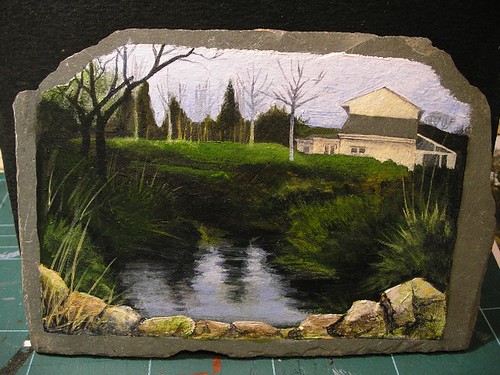
I need your help. I said I was going to keep you posted on the slate picture, which isn't far off done, but I'm not happy with it. It doesn't feel "whole" somehow, like the balance is wrong. I can't decide whether it's too busy, or whether the wall in the foreground needs to be darker/ more contrasty. It's a tricky one as the photos I'm working from were taken in really dull weather (most of the foreground is almost black so I'm making up the detail) and I normally prefer to paint more contrasty scenes so it might just be my preference, but any comments or suggestions are welcome:
I need your help. I said I was going to keep you posted on the slate picture, which isn't far off done, but I'm not happy with it. It doesn't feel "whole" somehow, like the balance is wrong. I can't decide whether it's too busy, or whether the wall in the foreground needs to be darker/ more contrasty. It's a tricky one as the photos I'm working from were taken in really dull weather (most of the foreground is almost black so I'm making up the detail) and I normally prefer to paint more contrasty scenes so it might just be my preference, but any comments or suggestions are welcome:
Cheers!
R
Well, I personally don't like the wall in the front as it seems to be a settling point for the eye. I sort of get locked into that area. This would be a drastic change but what about taking the wall motif, and moving it back to halfway up the pond and only on the left hand side. This would help to better balance the lightness of the building. Just a thought. Or actually, now that i look again, if you remove 2/3 of the wall on the right side and back fill with more grassy elements you can balance the building, keep the wall where it is and not trap the eye.
Well, I personally don't like the wall in the front as it seems to be a settling point for the eye. I sort of get locked into that area. This would be a drastic change but what about taking the wall motif, and moving it back to halfway up the pond and only on the left hand side. This would help to better balance the lightness of the building. Just a thought. Or actually, now that i look again, if you remove 2/3 of the wall on the right side and back fill with more grassy elements you can balance the building, keep the wall where it is and not trap the eye.
I like your second suggestion actually, that might work. It probably goes too far up on the right doesn't it? I can't really move it as it's what their back garden looks like so they'd know!
I like your second suggestion actually, that might work. It probably goes too far up on the right doesn't it? I can't really move it as it's what their back garden looks like so they'd know!
Cheers!
Incidentally - no black or payne's grey!
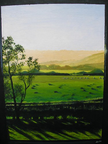
LOL! Looks great! Love your other stuff too BTW! Especially the field scene! Those long deep shadows are really great!
You can see some of my stuff here: Saturns-Eye on deviantART I haven't updated this site in ages though. I pretty much quit using it when it started to become more like an artsy myspace.
I love your use of colour - notable one is the heron (is it a heron?) where you've got the really vivid blue on orange. Some of the mountain scenes really remind me of Cezanne, then you've got some in a really different style - I love "Even in death" - very Dali and really atmospheric and mysterious. I've got a photo of a lone horse on Dartmoor in a stormy landscape that I've sometimes felt I'd like to paint and it kind of feels similar.
I put loads of stuff in WarmToastCafe but I can't access it from here so no link. Anyway you've had enough of mine.
Thanks! Ah, the heron is something I favorited by another artist and not my work. What is WarmToastCafe? Never heard of it.
There's usually some really interesting stuff on there and it's free to add your own. They have competitions and a little forum to post work and get it critiqued (if I remember right.) I'm studio 88.
You are nice - thank you! Can't rep you again yet - doh.
Please register to post and access all features of our very popular forum. It is free and quick. Over $68,000 in prizes has already been given out to active posters on our forum. Additional giveaways are planned.
Detailed information about all U.S. cities, counties, and zip codes on our site: City-data.com.

 Please register to participate in our discussions with 2 million other members - it's free and quick! Some forums can only be seen by registered members. After you create your account, you'll be able to customize options and access all our 15,000 new posts/day with fewer ads.