Please register to participate in our discussions with 2 million other members - it's free and quick! Some forums can only be seen by registered members. After you create your account, you'll be able to customize options and access all our 15,000 new posts/day with fewer ads.
Some people need to realize NOAA is not using "adjusted" temps. The other thing people need to realize is, NOAA continues to make recent temps warmer and pre 1950 temps cooler. Think about that one, thats all available for public to see. NOAA continues to brainwash everyone thinking we are all warming.
As I showed on my map, only 25% of the country had extreme heat... Let me explain that better...
Even using all areas of above normal temps in July we would NOT break the all time record for warmest July. Look at the legend again.. The pinks you see are simply above normal by 1-3 degrees. Being 1-3 above normal is not HOT!
We simply broke the record because of that small area in the center part of the country which was up to 7-8 degrees above.. Thats simple math and common sense.
Then you have the Data differences. NASA GIS 'adjusted data that cooled much of the 1930s, or old data that wasnt used.
The cool spot's right over the Great Lakes. This is great. Hopefully they're not overestimating the temperature drop.
Bring on the cool spots! It looks to me like you're going to finally get a cooloff this month. If anything I think the forecast is underestimating the drop. The latest GFS runs have you not getting above 70F, though it will be close and could go either way. A wholesale pattern change appears to be taking place in the East. I believe most of the East from this point on will be normal to cooler than normal.
This is good news if you're looking for a gradual step-down in departures leading up to an extremely cold winter, as the CFS is showing (for what it's worth the JMA and Euro are coming around too). The daily weather maps for winter from the CFS, while very inaccurate, do portray something of the day-to-day weather one can expect from the kind of pattern it's showing, and it's a real doozy. See my other post for more details on that, seeing as talking about extreme winter cold is off-topic for a summer thread.
Quote:
Originally Posted by nei
The average for the entire country is record breaking, that says nothing for whether pieces broke an individual record. You'd have to do the math out, but it's possible to have a situation where most individual sections were above average and few if any where record breaking but the entire country breaks a record, because so much area is somewhat above average at once.
The fine distinction must be made, though, so as to not generalize. The country's temperatures averaged out hit a new record, but it should be pointed out that the entire surface of the country did not hit a new record. I've seen people generalize like that and it's most annoying. While there are places that smashed records, other places were actually normal or even a bit below normal. That's just how the math works.
I would like to point out that I think the media organizations have done a good job in reporting the relevant facts. One article I read pointed out the geographic distribution of the heat (i.e. Plains scorching, PacNW normal), so I doubt there will be much confusion.
Quote:
Originally Posted by Cambium
Does anyone want to rebuttle this? Seems like less than 25% of the country was the only spot in July well above normal. The rest was either above, normal, or below.
The places that were much above normal were really scorching, though, and the math averages out for a lower 48 record high. However, although the vast majority of the country was above normal, the area of well above normal conditions is smaller than one might assume. It's certainly quite a bit smaller than last March's heat wave .
Quote:
So I hope people dont think the "entire" country was record breaking. This is the typical brainwash stories that they try to throw on us. It was Just because of a small area in the U.S we broke a record monthly High mean temp.
Exactly. As I said, that's just how the math works, and people can and sometimes do confuse things like that. I think, however, that those facts that you and I mentioned have been laid out in most media reports I've seen, so there will be little confusion. In this case there isn't much brainwashing going on; just cold, hard facts .
Quote:
Originally Posted by Cambium
Some people need to realize NOAA is not using "adjusted" temps. The other thing people need to realize is, NOAA continues to make recent temps warmer and pre 1950 temps cooler. Think about that one, thats all available for public to see. NOAA continues to brainwash everyone thinking we are all warming.
You might have something there. I've been observing the adjustments and they are too suspicious to ignore. I'd like to see a complete investigation into the issue, with the unadjusted data being available, and a complete breakdown of all the adjustments and the reasons for them. There may be good reasons to make adjustments, and in some cases there probably is*, but it just seems fishy.
*For some purposes. To gauge the actual temperature of the country I'd like to see an uncorrupted average, only adjusted to correct measuring errors and the like. For the actual temperature I don't want to see some dataset that is adjusted for urban heat islands and a number of other reasons. However, a UHI adjustment is necessary to gauge the real degree of background warming, so for that purpose I'd like to see some adjustments.
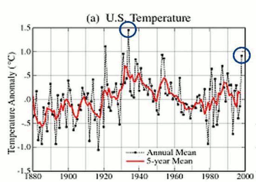
EDIT: I see with the comparison that the pre-1950 temperatures haven't had a significant change. What's changed is the recent temperatures, from circa 1985 onwards. I would think if anything the more recent temperatures would require less adjusting than the distant past ones. The 30-year normals and things like that may change, but the shape of the chart would remain the same.
I'd also like to point out that the comparison for the warmer chart includes post-2000 temperatures, whereas the cooler one shows temperatures only going up to 2000. That can be misleading, though I fault the people at that website more than Cambium himself. However, even excluding that there is a change. Hmm....
Last edited by Patricius Maximus; 08-09-2012 at 05:41 AM..
One of the main reasons for adjustments is Time of Observation Bias — some weather stations were not observed regularly at the same time. Other weather stations may have been moved for unknown reasons and require what's called homogenization.
What's puzzling about the graph, which unlike the "US had a record year" is deliberately misleading; the two graphs show different time periods, is why it looks like 1980-2000 was adjusted the most. I'd expect that period to be adjusted the least.
In this case there isn't much brainwashing going on; just cold, hard facts
.
Then how about a headline like "Lower 48 records Hottest July Ever due in part of Central U.S". That gives the whole story because people will realize the entire country wasnt record breaking.
I know it's much less but I can give you all areas that were actually below normal. In fact, do they even mention those areas in the report?? I also see they left Alsaka out.
What's puzzling about the graph, which unlike the "US had a record year" is deliberately misleading; the two graphs show different time periods, is why it looks like 1980-2000 was adjusted the most.
Not exactly. Even if I put my hand over the post-2000 portion (which we all should) I still notice changes. Although the general shape of the graph is misleading, it's not entirely misleading.
Quote:
I'd expect that period to be adjusted the least.
Exactly my question.
Quote:
Originally Posted by Cambium
Then how about a headline like "Lower 48 records Hottest July Ever due in part of Central U.S". That gives the whole story because people will realize the entire country wasnt record breaking.
That would be more informative, sure.
Quote:
I know it's much less but I can give you all areas that were actually below normal. In fact, do they even mention those areas in the report??
The articles I've seen references areas that were near normal, i.e. the state of Washington was overall near normal. However, the cooler than normal areas by the coast were left out of the media reports I saw.
Quote:
I also see they left Alsaka out.
They always do that no matter what the headline is or what Alaska's weather is. Perhaps the Alaskan Independence Party has already won - NOAA acts like it's a different country . They also do the same thing to Hawaii. Excluding Alaska and Hawaii, and then calling a lower 48 record a record for the whole country seems really biased to me. In this case, though, it's not a pro-AGW bias, it's a pro-lower 48 bias.
Quote:
Originally Posted by Cambium
Question is... Which area will your eyes focus on here.
July 2012 Temperature departures.
The Central region was absolutely roasting. 8 degrees above normal is nothing trivial when it comes to summer (or even winter when it's 8 below normal). I do notice a curious area of cooler than normal spots in the Pacific coast and the Southwest.
And I thought we were getting a hot summer, I didn't realize how off the charts parts of the centeral US was.
You took the words right out of my mouth!!
I've been bi__chin and moaning about this summer. It's been suicidal for me. Complete disgusted and nerve wracking. I open the door and there's no break, it hits me right in the face with unbreathable air (mostly humid air). Temps only have been in the 80s but its that humidity down here which has me going insane.
But I CANNOT image what they are going through where's it's actually been extreme. I would just check myself in.
Does anyone know where we can find data for humidity itself? Why do I feel like this year is killing the East Coast with it?? Seems like everyday we've had dewpoints and humidity over 70!
Hot in Spain (and less so in SW France) today.
Cordoba (38N) probably hit 45°C/113°F today.
Quite sticky in Moron de la Frontera, with 42°C/108°F combined with a dew point of 23°C/73°F, yielding a heat index of 50C/122F.
Please register to post and access all features of our very popular forum. It is free and quick. Over $68,000 in prizes has already been given out to active posters on our forum. Additional giveaways are planned.
Detailed information about all U.S. cities, counties, and zip codes on our site: City-data.com.

 Please register to participate in our discussions with 2 million other members - it's free and quick! Some forums can only be seen by registered members. After you create your account, you'll be able to customize options and access all our 15,000 new posts/day with fewer ads.


 .
. .
.
 . They also do the same thing to Hawaii. Excluding Alaska and Hawaii, and then calling a lower 48 record a record for the whole country seems really biased to me. In this case, though, it's not a pro-AGW bias, it's a pro-lower 48 bias.
