Please register to participate in our discussions with 2 million other members - it's free and quick! Some forums can only be seen by registered members. After you create your account, you'll be able to customize options and access all our 15,000 new posts/day with fewer ads.
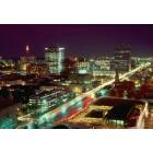
Here's the rendering from the article. I like the design but the color scheme is too neutral IMO:
I like the tie-in to the existing buildings with the palm trees and I wonder if they could simply pull a few of those colors as accents in the gray sections? That'a really easy solve that I don't think would materially impact the aesthetics of the building, but would help provide a small amount of variation in the facade.
I also disagree that the Empire Apartments next to IHOP on Assembly is bland. It's not groundbreaking but definitely not bland either. I like corner facade that resembles wood paneling and the portion along Assembly at the street level that's brick-ish.
Quote:
Originally Posted by carolinagarnet
I like the tie-in to the existing buildings with the palm trees and I wonder if they could simply pull a few of those colors as accents in the gray sections? That'a really easy solve that I don't think would materially impact the aesthetics of the building, but would help provide a small amount of variation in the facade.
Precisely. Hopefully that's a recommendation the DDRC will make.
I guess bland is subjective. A building can look good from one angle and bland from a different spot. But at any rate, I guess sometimes we don’t realize how we come across on here. What one person might call bland another might call simplistic. I find the Assembly and Lady rendering to be attractive both in design and color scheme. The Main and Lady elevation is okay but could have used something more on the corner. Driving along Assembly with a turn of my head to view the new building next to IHOP, I have a bland experience. Oh, well. That’s my opinion. I get the same experience driving east on Vanderhorst Street approaching Charleston’s new Hotel Bennett. But this isn’t a Charleston thread.
I guess bland is subjective. A building can look good from one angle and bland from a different spot. But at any rate, I guess sometimes we don’t realize how we come across on here. What one person might call bland another might call simplistic. I find the Assembly and Lady rendering to be attractive both in design and color scheme. The Main and Lady elevation is okay but could have used something more on the corner. Driving along Assembly with a turn of my head to view the new building next to IHOP, I have a bland experience. Oh, well. That’s my opinion. I get the same experience driving east on Vanderhorst Street approaching Charleston’s new Hotel Bennett. But this isn’t a Charleston thread.
I can understand what you mean now that you've explained yourself a bit more. I think Hotel Bennett has a bland color scheme but the architecture is quite remarkable.
Unpopular Opinion. We need more Modern Brutalist buildings. I would like to see that massive hotel that's planning to get built along with the Convention Center Expansion have a Modern twist on brutalism.
Yes I'm a huge fan of brutalism. And Columbia has a lot of those buildings.
Please register to post and access all features of our very popular forum. It is free and quick. Over $68,000 in prizes has already been given out to active posters on our forum. Additional giveaways are planned.
Detailed information about all U.S. cities, counties, and zip codes on our site: City-data.com.

 Please register to participate in our discussions with 2 million other members - it's free and quick! Some forums can only be seen by registered members. After you create your account, you'll be able to customize options and access all our 15,000 new posts/day with fewer ads.